// portfolio.jsx — Carter Groff portfolio, "Parlor" direction.
// Single, full-bleed page. Sections in order: Hero, About, Video Work,
// Design Portfolio, Resume, Contact, Footer.

const { PhotoPlaceholder, PaperFrame, GasLamp, LampMan, HangingLantern, FloorLamp, LanternDefs, Raven, IvyVine, IvyCurl, FernFrond, BotanicalDivider, BranchSprig, LooseSprig, BotanicalDefs } = window.CG_MOTIFS;
const D = window.CG_DATA;
const THEME = window.CG_THEME;

// Tracks the OS-level "reduce motion" preference so decorative components
// (the raven's flight-in, scroll reveals, parallax) can offer a static
// fallback instead of animating.
function usePrefersReducedMotion() {
  const [reduced, setReduced] = React.useState(() =>
    typeof window !== 'undefined' && window.matchMedia
      ? window.matchMedia('(prefers-reduced-motion: reduce)').matches
      : false);
  React.useEffect(() => {
    if (!window.matchMedia) return;
    const mq = window.matchMedia('(prefers-reduced-motion: reduce)');
    const onChange = () => setReduced(mq.matches);
    mq.addEventListener ? mq.addEventListener('change', onChange) : mq.addListener(onChange);
    return () => {
      mq.removeEventListener ? mq.removeEventListener('change', onChange) : mq.removeListener(onChange);
    };
  }, []);
  return reduced;
}

// Warm sepia palette for the work tiles, with a couple of greens (moss, sage)
// mixed in for variety — the new character.
const TILE_HUES = [
  'linear-gradient(150deg, #6a4a2c 0%, #2a1a0e 100%)',  // tobacco
  'linear-gradient(150deg, #8a5a36 0%, #321e10 100%)',  // amber leather
  'linear-gradient(150deg, #c97a48 0%, #4a2616 100%)',  // rust
  'linear-gradient(150deg, #5e6a4c 0%, #1e2418 100%)',  // moss (green)
  'linear-gradient(150deg, #d99a3d 0%, #5a3a1a 100%)',  // candlelight
  'linear-gradient(150deg, #4a3a2a 0%, #15100a 100%)',  // walnut
  'linear-gradient(150deg, #936a44 0%, #2a1a10 100%)',  // worn brass
  'linear-gradient(150deg, #6a4438 0%, #1e120c 100%)',  // dried blood
  'linear-gradient(150deg, #8a9670 0%, #2a3220 100%)',  // sage (green)
];

// Pull a still frame from a YouTube/Vimeo-ish URL so videos without an
// uploaded thumbnail still show a picture. Returns '' if none can be derived.
function ytThumb(url) {
  if (!url) return '';
  const m = String(url).match(/(?:youtu\.be\/|youtube\.com\/(?:watch\?v=|embed\/|v\/|shorts\/|live\/))([\w-]{11})/);
  return m ? `https://img.youtube.com/vi/${m[1]}/hqdefault.jpg` : '';
}

// Build a playable embed URL (autoplay) from a YouTube or Vimeo link.
function videoEmbed(url) {
  if (!url) return '';
  let m = String(url).match(/(?:youtu\.be\/|youtube\.com\/(?:watch\?v=|embed\/|v\/|shorts\/|live\/))([\w-]{11})/);
  if (m) return `https://www.youtube-nocookie.com/embed/${m[1]}?autoplay=1&rel=0`;
  m = String(url).match(/vimeo\.com\/(?:video\/)?(\d+)/);
  if (m) return `https://player.vimeo.com/video/${m[1]}?autoplay=1`;
  return '';
}

// PDF helpers — designs may hold a PDF data URL instead of an image.
function isPdfData(v) { return typeof v === 'string' && v.startsWith('data:application/pdf'); }
function dataUrlToBlobUrl(dataUrl) {
  try {
    const [meta, b64] = dataUrl.split(',');
    const mime = (meta.match(/data:(.*?);base64/) || [])[1] || 'application/pdf';
    const bin = atob(b64);
    const arr = new Uint8Array(bin.length);
    for (let i = 0; i < bin.length; i++) arr[i] = bin.charCodeAt(i);
    return URL.createObjectURL(new Blob([arr], { type: mime }));
  } catch (e) { return ''; }
}

// ── Nav ─────────────────────────────────────────────────────────────
function Nav() {
  const [scrolled, setScrolled] = React.useState(false);
  const [menuOpen, setMenuOpen] = React.useState(false);
  React.useEffect(() => {
    const f = () => setScrolled(window.scrollY > 60);
    window.addEventListener('scroll', f, { passive: true });
    return () => window.removeEventListener('scroll', f);
  }, []);
  // Lock body scroll while the mobile drawer is open.
  React.useEffect(() => {
    if (!menuOpen) return;
    const prev = document.body.style.overflow;
    document.body.style.overflow = 'hidden';
    return () => { document.body.style.overflow = prev; };
  }, [menuOpen]);
  const links = D.nav.map((n) => {
    const anchor = { video: '#sec-work', work: '#sec-work' }[n.toLowerCase()] || `#sec-${n.toLowerCase()}`;
    return { n, anchor };
  });
  return (
    <React.Fragment>
    <nav className="cg-nav" style={{
      position: 'fixed', top: 0, left: 0, right: 0, zIndex: 50,
      background: scrolled ? 'rgba(15, 10, 6, 0.78)' : 'transparent',
      backdropFilter: scrolled ? 'blur(14px)' : 'none',
      borderBottom: scrolled ? '1px solid var(--rule)' : '1px solid transparent',
      transition: 'background .4s ease, border-color .4s ease, backdrop-filter .4s ease',
      padding: '22px 64px',
      display: 'flex', alignItems: 'center', justifyContent: 'space-between',
      fontFamily: 'var(--ui-font)',
    }}>
      <a href="#sec-top" className="cg-nav-logo" style={{ display: 'flex', alignItems: 'center', gap: 14, textDecoration: 'none' }}>
        <div className="cg-nav-mark" style={{ width: 38, height: 38, border: '1px solid var(--ink-dim)',
          display: 'flex', alignItems: 'center', justifyContent: 'center' }}>
          <img src="assets/logo.png" alt="Carter Groff" style={{ width: '76%', height: '76%', objectFit: 'contain' }} />
        </div>
        <div>
          <div style={{ fontFamily: 'var(--display-font)', fontSize: 17,
            fontWeight: 500, letterSpacing: '-0.01em',
            color: 'var(--ink)', lineHeight: 1 }}>Carter Groff</div>
          <div style={{ fontSize: 9, letterSpacing: '0.3em', textTransform: 'uppercase',
            color: 'var(--ink-mute)', marginTop: 4 }}>Marketing &amp; Media</div>
        </div>
      </a>
      <div className="cg-nav-links" style={{ display: 'flex', gap: 38, alignItems: 'center' }}>
        {links.map(({ n, anchor }) => (
          <a key={n} href={anchor}
            style={{ fontSize: 11, color: 'var(--ink-soft)', textDecoration: 'none',
              letterSpacing: '0.24em', textTransform: 'uppercase', fontFamily: 'var(--ui-font)',
              fontWeight: 500 }}>{n}</a>
        ))}
        <a href="#sec-contact" style={{
          fontSize: 10, color: 'var(--ink)', border: '1px solid var(--ink-dim)',
          padding: '11px 18px', textDecoration: 'none', whiteSpace: 'nowrap',
          letterSpacing: '0.26em', textTransform: 'uppercase', fontFamily: 'var(--ui-font)',
          fontWeight: 500,
        }}>Get in touch</a>
      </div>

      {/* Mobile hamburger — hidden on desktop via CSS */}
      <button className="cg-nav-burger" aria-label={menuOpen ? 'Close menu' : 'Open menu'}
        aria-expanded={menuOpen} onClick={() => setMenuOpen((o) => !o)}>
        <span className={'cg-burger-ico' + (menuOpen ? ' is-open' : '')}>
          <span></span><span></span><span></span>
        </span>
      </button>

    </nav>

    {/* Mobile slide-in drawer — a sibling of <nav>, not nested inside it.
        <nav> applies a backdrop-filter once scrolled, which creates a new
        CSS containing block for any position:fixed descendant — that was
        collapsing this drawer to the nav's own height instead of the
        full viewport whenever the menu was opened while scrolled down. */}
    <div className={'cg-nav-drawer' + (menuOpen ? ' is-open' : '')}
      role="dialog" aria-modal="true" aria-hidden={!menuOpen}
      onClick={() => setMenuOpen(false)}>
      <div className="cg-nav-drawer-panel" onClick={(e) => e.stopPropagation()}>
        {links.map(({ n, anchor }) => (
          <a key={n} href={anchor} onClick={() => setMenuOpen(false)}>{n}</a>
        ))}
        <a href="#sec-contact" className="cg-nav-drawer-cta" onClick={() => setMenuOpen(false)}>Get in touch</a>
      </div>
    </div>
    </React.Fragment>
  );
}

// ── Hero ambiance — rain layer ──────────────────────────────────────
// ~50 fine near-vertical strokes, sparse, slow, low-opacity. Randomized
// once (useMemo) so positions/speeds are stable across re-renders.
function RainLayer() {
  const drops = React.useMemo(() => {
    const n = 52;
    return Array.from({ length: n }, (_, i) => {
      const r = (s) => { const x = Math.sin((i + 1) * s) * 43758.5453; return x - Math.floor(x); };
      return {
        left: (r(12.9) * 100).toFixed(2),
        height: (15 + r(7.1) * 10).toFixed(1),       // 15–25px
        dur: (8 + r(3.3) * 6).toFixed(2),            // 8–14s
        delay: (-r(9.7) * 14).toFixed(2),            // staggered
        opacity: (0.08 + r(5.2) * 0.04).toFixed(3),  // 0.08–0.12
      };
    });
  }, []);
  return (
    <div style={{ position: 'absolute', inset: 0, overflow: 'hidden', pointerEvents: 'none', zIndex: 1 }}>
      {drops.map((d, i) => (
        <span key={i} className="cg-rain-drop" style={{
          left: d.left + '%', height: d.height + 'px', opacity: (parseFloat(d.opacity) + 0.08).toFixed(3),
          animationDuration: d.dur + 's', animationDelay: d.delay + 's',
          transform: 'rotate(6deg)' }} />
      ))}
    </div>
  );
}

// ── Easter-egg candle ───────────────────────────────────────────────
// Three depth planes receding into a cavernous dark: near (large, sharp,
// saturated), mid (smaller, soft), far (tiny, dim, blurred). Each plane
// also defines how wide/bright a pool of light its candles cast.
// Depth is pushed hard so the space reads as genuinely deep: near candles
// are full-size, bright and sharp; mid are nearly half-size and dim; far are
// tiny faint motes almost swallowed by the dark — distant lights in a cave.
// `spread` is how far (px) the warm light pool reaches around the flame.
const CANDLE_DEPTH = {
  near: { scale: 1.0,  blur: 0,    sat: 1.0,  bright: 1.0,  spread: 120, peak: 0.22, ground: true,  smoke: true,  drips: true },
  mid:  { scale: 0.62, blur: 0.7,  sat: 0.82, bright: 0.8,  spread: 72,  peak: 0.14, ground: true,  smoke: true,  drips: true },
  far:  { scale: 0.42, blur: 1.4,  sat: 0.62, bright: 0.55, spread: 38,  peak: 0.08, ground: false, smoke: false, drips: true },
};

// Broad pool of warm light a candle throws onto its surroundings (centred on
// the flame, casts both down and faintly up). Reaches `spread` px around it.
function CandlePool({ pos, lit }) {
  const d = CANDLE_DEPTH[pos.depth] || CANDLE_DEPTH.near;
  const scale = d.scale, R = (d.spread * 2) + 24 * scale;
  const anchor = 48 * scale; // flame height above the candle base, in px
  return (
    <div style={{ position: 'absolute',
      left: `calc(${pos.left} + ${(13 * scale) - R / 2}px)`,
      bottom: `calc(${pos.bottom} + ${anchor - R / 2}px)`,
      width: R, height: R, borderRadius: '50%', pointerEvents: 'none',
      background: `radial-gradient(circle, rgba(210,140,30,${d.peak}) 0%, rgba(210,140,30,${(d.peak * 0.4).toFixed(3)}) 24%, rgba(210,140,30,0) 70%)`,
      mixBlendMode: 'screen',
      filter: `blur(${(d.blur * 3 + 4).toFixed(1)}px)`,
      opacity: lit ? 1 : 0, transition: 'opacity 0.6s ease' }} />
  );
}

// Four flame motions + three flame/core shapes, picked per candle so every
// flame is doing something different.
const FLAME_DANCES = ['cg-flame-dance', 'cg-flame-dance-b', 'cg-flame-dance-c', 'cg-flame-dance-d'];
const FLAME_SHAPES = [
  'M 13 2.5 C 17.6 10, 18.8 16, 14 24.5 C 9.2 20, 7.8 11.5, 13 2.5 Z',
  'M 13 5 C 18.4 11, 19 17.5, 14 24.5 C 9 20.5, 7.6 13.5, 13 5 Z',
  'M 12.4 1 C 18 8, 16.8 17, 14.2 24.5 C 9.4 21, 9.2 11, 12.4 1 Z',
];
const CORE_SHAPES = [
  'M 13 9 C 15.2 13, 15 18, 13 22.5 C 11 18, 10.9 13, 13 9 Z',
  'M 13 11 C 15 14.5, 15 18.5, 13 22.5 C 11 18.5, 11 14.5, 13 11 Z',
  'M 12.7 8 C 14.8 12.5, 14.6 18, 13 22.5 C 11.4 18, 11.4 12.5, 12.7 8 Z',
];

// A single candle — an old, melted wax stub pooling onto the floor that
// catches its own light, with an irregular leaning flame (unique motion +
// shape per candle) wrapped in a glow halo, a grounding pool below, and a
// wisp of smoke. `lit` fades it in/out; the flame flickers forever, de-synced.
function Candle({ pos, lit }) {
  const d = CANDLE_DEPTH[pos.depth] || CANDLE_DEPTH.near;
  const scale = d.scale;
  const W = 26 * scale, H = 72 * scale;
  // de-sync each flame so no two flicker together
  const danceDur = (1.25 + (pos.seed % 10) * 0.17).toFixed(2);
  const coreDur = (1.05 + (pos.seed % 7) * 0.205).toFixed(2);
  const glowDur = (2.0 + (pos.seed % 8) * 0.16).toFixed(2);
  const delay = ((pos.seed % 13) * -0.19).toFixed(2);
  const coreDelay = ((pos.seed % 9) * -0.14 - 0.07).toFixed(2);
  const smokeDelay = ((pos.seed % 6) * -1).toFixed(2);
  // each candle gets its own motion + shape
  const danceName = FLAME_DANCES[pos.seed % 4];
  const coreName = FLAME_DANCES[(pos.seed + 2) % 4];
  const flamePath = FLAME_SHAPES[pos.seed % 3];
  const corePath = CORE_SHAPES[(pos.seed + 1) % 3];
  // caught in a faint draft — lean a random 5–15° left or right
  const lean = (pos.seed % 2 ? 1 : -1) * (5 + (pos.seed * 3) % 11);
  const danceAnim = lit ? `${danceName} ${danceDur}s ease-in-out ${delay}s infinite, cg-candle-appear 1s ease-out` : 'none';
  const coreAnim = lit ? `${coreName} ${coreDur}s ease-in-out ${coreDelay}s infinite` : 'none';
  // how melted this candle is — taller (0) vs stub (2); shifts the flame down
  const melt = pos.seed % 3;
  const topY = [30, 37, 45][melt];
  const dy = topY - 30;
  const haloR = 72 * scale;
  return (
    <div style={{ position: 'absolute', left: pos.left, bottom: pos.bottom,
      width: W, transformOrigin: 'bottom center',
      opacity: lit ? 1 : 0, transition: 'opacity 0.55s ease',
      filter: `${d.blur ? `blur(${d.blur}px) ` : ''}saturate(${d.sat}) brightness(${d.bright})` }}>

      {/* warm elliptical glow on the surface directly below — grounds it */}
      {d.ground && (
        <div style={{ position: 'absolute', left: '50%', bottom: -8 * scale,
          width: haloR * 1.9, height: haloR * 0.6, transform: 'translateX(-50%)',
          background: 'radial-gradient(ellipse at 50% 50%, rgba(180,110,15,0.2) 0%, rgba(180,110,15,0) 70%)',
          pointerEvents: 'none' }} />
      )}

      {/* soft blurred halo behind the flame — near/mid only (far ones rely on
          their pool; keeps 20+ candles from each carrying a costly blur) */}
      {d.ground && (
        <div style={{ position: 'absolute', left: '50%', top: (15 + dy) * scale,
          width: haloR, height: haloR * 1.15, transform: 'translate(-50%, -50%)',
          background: 'radial-gradient(circle, rgba(220,140,20,0.25) 0%, rgba(220,140,20,0) 66%)',
          filter: 'blur(11px)', pointerEvents: 'none' }} />
      )}

      <svg viewBox="0 0 26 72" width={W} height={H}
        style={{ display: 'block', overflow: 'visible', position: 'relative' }}>
        <defs>
          {/* aged wax — warm off-white, darker + melted toward the base */}
          <linearGradient id={`wax-${pos.key}`} x1="0" y1="0" x2="0" y2="1">
            <stop offset="0%"   stopColor="#e6dcbb" />
            <stop offset="48%"  stopColor="#d8ceaa" />
            <stop offset="100%" stopColor="#9c8c64" />
          </linearGradient>
          {/* flame body — deep orange-red base → amber → near-white tip */}
          <linearGradient id={`flameBody-${pos.key}`} x1="0.5" y1="1" x2="0.5" y2="0">
            <stop offset="0%"   stopColor="#a82d06" />
            <stop offset="30%"  stopColor="#ef7913" />
            <stop offset="62%"  stopColor="#f8b62f" />
            <stop offset="100%" stopColor="#fff4c2" />
          </linearGradient>
          <radialGradient id={`flameGlow-${pos.key}`} cx="50%" cy="58%" r="55%">
            <stop offset="0%"   stopColor="#ffcd5c" stopOpacity="0.85" />
            <stop offset="45%"  stopColor="#f59a1f" stopOpacity="0.34" />
            <stop offset="100%" stopColor="#f59a1f" stopOpacity="0" />
          </radialGradient>
          {/* translucent warm core inside the wax near the flame */}
          <radialGradient id={`waxInner-${pos.key}`} cx="50%" cy="30%" r="62%">
            <stop offset="0%"   stopColor="#ffcf6a" stopOpacity="0.5" />
            <stop offset="55%"  stopColor="#e89a2e" stopOpacity="0.12" />
            <stop offset="100%" stopColor="#e89a2e" stopOpacity="0" />
          </radialGradient>
          {/* self-glow: the wax catches its own candlelight */}
          <filter id={`waxGlow-${pos.key}`} x="-70%" y="-40%" width="240%" height="180%">
            <feDropShadow dx="0" dy="0" stdDeviation="2.4" floodColor="#c88214" floodOpacity="0.42" />
          </filter>
        </defs>

        {/* old, melted, uneven wax body — near/mid catch their own warm glow */}
        <path d={`M 9.4 ${topY + 2} C 8.5 ${topY + 13}, 9.8 54, 10.2 70 L 15.8 70 C 16.3 55, 17.5 ${topY + 11}, 16.6 ${topY + 2} C 16 ${topY - 1}, 14.6 ${topY + 1.5}, 13.3 ${topY - 0.5} C 12 ${topY + 1.5}, 10.3 ${topY - 0.5}, 9.4 ${topY + 2} Z`}
          fill={`url(#wax-${pos.key})`} filter={d.ground ? `url(#waxGlow-${pos.key})` : undefined} />
        {/* translucent warm glow up near the flame */}
        <ellipse cx="13" cy={topY + 8} rx="3.4" ry="9" fill={`url(#waxInner-${pos.key})`} />
        <line x1="11.4" y1={topY + 4} x2="11.2" y2="68" stroke="#fff" strokeOpacity="0.2" strokeWidth="0.6" />
        {/* melted, slumping lip at the top of the wax */}
        <ellipse cx="13" cy={topY} rx="3.7" ry="1.4" fill="#dccfa3" />

        {/* flame + wick assembly — translated down to sit on a melted stub */}
        <g transform={`translate(0 ${dy})`}>
          <rect x="12.4" y="19" width="1.2" height="7" rx="0.6" fill="#2e2114" />
          {/* barely-there wisp of smoke */}
          {d.smoke && (
            <path d="M 13 1 q -3.5 -7 0.5 -13 q 3.5 -5.5 -0.5 -12" fill="none"
              stroke="#d8d2c8" strokeWidth="1.4" strokeLinecap="round" opacity="0.06"
              style={{ transformBox: 'fill-box', transformOrigin: '50% 100%',
                animation: lit ? `cg-smoke-rise 6s ease-in-out ${smokeDelay}s infinite` : 'none' }} />
          )}
          {/* soft halo right behind the flame (inner) */}
          <ellipse cx="13" cy="16" rx="12" ry="16" fill={`url(#flameGlow-${pos.key})`}
            style={{ transformOrigin: '13px 25px', animation: lit ? `cg-flame-glow ${glowDur}s ease-in-out ${delay}s infinite` : 'none' }} />
          {/* leaning flame group — caught in a draft */}
          <g transform={`rotate(${lean} 13 25)`}>
            {/* faint blue tinge where the flame meets the wick */}
            <ellipse cx="13" cy="23.5" rx="2.6" ry="3.4" fill="#6ba3e0" opacity="0.3" />
            {/* irregular teardrop flame — unique shape + motion */}
            <path d={flamePath} fill={`url(#flameBody-${pos.key})`}
              style={{ transformOrigin: '13px 25px', animation: danceAnim }} />
            {/* hot inner core toward the tip */}
            <path d={corePath} fill="#fff7dc" opacity="0.9"
              style={{ transformOrigin: '13px 24px', animation: coreAnim }} />
          </g>
        </g>
      </svg>
    </div>
  );
}

// Candidate candle spots across the hero — scattered on ledges, near the
// text and along the bottom edge, kept clear of the lamp on the far right.
// Near candles sit large up front along the bottom; mid + far ones are kept
// to the open margins (left edge, the corridor between the name and the lamp,
// and the band below the headline) so none pop up over the name.
const CANDLE_SPOTS = [
  // near — big foreground candles along the bottom edge
  { key: 'c0',  left: '12%', bottom: '7%',  depth: 'near', seed: 3 },
  { key: 'c1',  left: '26%', bottom: '6%',  depth: 'near', seed: 8 },
  { key: 'c2',  left: '40%', bottom: '9%',  depth: 'near', seed: 5 },
  { key: 'c3',  left: '52%', bottom: '6%',  depth: 'near', seed: 12 },
  { key: 'c4',  left: '6%',  bottom: '12%', depth: 'near', seed: 1 },
  // mid — kept low or out to the sides
  { key: 'c5',  left: '4%',  bottom: '22%', depth: 'mid',  seed: 9 },
  { key: 'c6',  left: '60%', bottom: '15%', depth: 'mid',  seed: 6 },
  { key: 'c7',  left: '70%', bottom: '23%', depth: 'mid',  seed: 14 },
  { key: 'c8',  left: '49%', bottom: '19%', depth: 'mid',  seed: 2 },
  { key: 'c9',  left: '64%', bottom: '30%', depth: 'mid',  seed: 10 },
  // far — left margin, the corridor right of the name, and above it
  { key: 'c10', left: '3%',  bottom: '38%', depth: 'far',  seed: 4 },
  { key: 'c11', left: '5%',  bottom: '52%', depth: 'far',  seed: 7 },
  { key: 'c12', left: '2%',  bottom: '66%', depth: 'far',  seed: 13 },
  { key: 'c13', left: '48%', bottom: '34%', depth: 'far',  seed: 0 },
  { key: 'c14', left: '57%', bottom: '41%', depth: 'far',  seed: 11 },
  { key: 'c15', left: '66%', bottom: '48%', depth: 'far',  seed: 15 },
  { key: 'c16', left: '72%', bottom: '38%', depth: 'far',  seed: 5 },
  { key: 'c17', left: '61%', bottom: '56%', depth: 'far',  seed: 9 },
  { key: 'c18', left: '53%', bottom: '28%', depth: 'far',  seed: 3 },
  { key: 'c19', left: '69%', bottom: '62%', depth: 'far',  seed: 12 },
  { key: 'c20', left: '5%',  bottom: '30%', depth: 'far',  seed: 8 },
  { key: 'c21', left: '3%',  bottom: '28%', depth: 'far',  seed: 6 },
];

// ── Hero ────────────────────────────────────────────────────────────
function Hero() {
  // Easter egg: click the lamp globe → lamp dies, candles light one by one.
  const [lampOut, setLampOut] = React.useState(false);
  const [spots, setSpots] = React.useState([]);      // chosen candles this cycle
  const [litCount, setLitCount] = React.useState(0);  // first N spots are lit
  const timers = React.useRef([]);
  const busy = React.useRef(false);                   // ignore clicks mid-transition

  const clearTimers = () => { timers.current.forEach(clearTimeout); timers.current = []; };
  const after = (ms, fn) => { const t = setTimeout(fn, ms); timers.current.push(t); return t; };
  React.useEffect(() => clearTimers, []);

  // Light candles one at a time, randomized 0.6–1.2s apart.
  const lightFrom = (i, total) => {
    if (i >= total) { busy.current = false; return; }
    setLitCount(i + 1);
    after(420 + Math.random() * 480, () => lightFrom(i + 1, total));
  };
  // Snuff candles one at a time (faster), then lift the dark + reignite lamp.
  const snuffFrom = (n) => {
    if (n <= 0) {
      setLampOut(false);                 // reignite halo + globe over 0.5s
      after(560, () => { setSpots([]); busy.current = false; });
      return;
    }
    setLitCount(n - 1);
    after(220 + Math.random() * 260, () => snuffFrom(n - 1));
  };

  const toggleLamp = () => {
    if (busy.current) return;
    clearTimers();
    if (!lampOut) {
      // ── Snuff the lamp, then light candles ──
      busy.current = true;
      setLampOut(true);
      // pick a big subset so the field reads as a deep sea of candles
      const count = Math.min(CANDLE_SPOTS.length, 13 + Math.floor(Math.random() * 6));
      const chosen = [...CANDLE_SPOTS].sort(() => Math.random() - 0.5).slice(0, count);
      setSpots(chosen);
      setLitCount(0);
      after(800, () => lightFrom(0, chosen.length));   // 0.8s pause in the dark
    } else {
      // ── Reverse: snuff candles, lift dark, reignite ──
      busy.current = true;
      snuffFrom(litCount);
    }
  };

  // How far the candle-lighting has progressed (0 → 1). The hero text slowly
  // brightens out of the dark as candles come alight, and the name picks up a
  // warm candle glow on top.
  const glow = lampOut && spots.length ? litCount / spots.length : (lampOut ? 0 : 1);
  const sceneBright = lampOut ? (0.12 + 0.88 * glow) : 1;
  const contentLit = { filter: `brightness(${sceneBright.toFixed(3)})`, transition: 'filter 0.7s ease' };
  const nameGlow = lampOut
    ? `0 0 ${(18 + 46 * glow).toFixed(0)}px rgba(220,150,45,${(0.32 * glow).toFixed(3)}), 0 0 ${(8 * glow).toFixed(0)}px rgba(255,205,110,${(0.22 * glow).toFixed(3)})`
    : 'none';

  return (
    <section id="sec-top" className="cg-wood" style={{
      position: 'relative', overflow: 'hidden',
      minHeight: '100vh', padding: '180px 80px 80px',
      display: 'flex', flexDirection: 'column', justifyContent: 'space-between',
    }}>
      {/* Pooled candle-light — the "single lamp" of the album cover */}
      <div className="cg-candlelight" style={{ top: '-12%', right: '-8%', width: 720, height: 720 }} />
      <div className="cg-candlelight" style={{ bottom: '-10%', left: '-6%', width: 500, height: 500, opacity: 0.6 }} />

      {/* Fog banks rolling in from the right, drifting left across the hero */}
      <div className="cg-fog-band" style={{ top: '24%', animation: 'cg-fog-roll 26s linear infinite', zIndex: 1 }} />
      <div className="cg-fog-band" style={{ top: '50%', animation: 'cg-fog-roll 34s linear infinite', animationDelay: '-12s', zIndex: 1 }} />
      <div className="cg-fog-band" style={{ top: '72%', animation: 'cg-fog-roll 30s linear infinite', animationDelay: '-20s', zIndex: 1 }} />

      {/* Quiet night — fog only */}

      {/* Deep vignette */}
      <div style={{ position: 'absolute', inset: 0, pointerEvents: 'none',
        background: 'radial-gradient(ellipse at 65% 30%, transparent 0%, rgba(8,5,2,0.55) 70%, rgba(8,5,2,0.85) 100%)' }} />

      {/* High-fidelity SVG lamp post on the right — anchored at the hero bottom. */}
      <div className="cg-fadeup cg-fadeup-3 cg-hero-lamp" style={{ position: 'absolute',
        right: '6vw', bottom: 0, zIndex: 2, pointerEvents: 'none' }}>
        <div style={{ position: 'relative' }}>
          <GasLamp height={680} out={lampOut} onGlobeClick={toggleLamp} />
        </div>
      </div>

      {/* Easter egg — page dims into a deep dark, as if the lamp was the only light */}
      <div style={{ position: 'absolute', inset: 0, zIndex: 3, pointerEvents: 'none',
        background: 'rgba(0,0,0,0.78)', opacity: lampOut ? 1 : 0,
        transition: 'opacity 0.5s ease' }} />

      {/* Far depth plane — tiny dim candles + their faint pools, set behind the fog */}
      <div style={{ position: 'absolute', inset: 0, zIndex: 4, pointerEvents: 'none' }}>
        {spots.map((p, i) => p.depth === 'far' && (
          <React.Fragment key={p.key}>
            <CandlePool pos={p} lit={i < litCount} />
            <Candle pos={p} lit={i < litCount} />
          </React.Fragment>
        ))}
      </div>

      {/* Drifting low mist between the depth planes — softly obscures the far candles */}
      <div className="cg-egg-fog" style={{ position: 'absolute', inset: 0, zIndex: 5,
        pointerEvents: 'none', opacity: lampOut ? 1 : 0, transition: 'opacity 0.9s ease' }} />

      {/* Mid + near planes — larger, sharper candles + brighter pools, in front of the fog */}
      <div style={{ position: 'absolute', inset: 0, zIndex: 6, pointerEvents: 'none' }}>
        {spots.map((p, i) => p.depth !== 'far' && (
          <React.Fragment key={p.key}>
            <CandlePool pos={p} lit={i < litCount} />
            <Candle pos={p} lit={i < litCount} />
          </React.Fragment>
        ))}
      </div>

      <div style={{ position: 'relative', zIndex: 7, marginTop: 60, ...contentLit }}>
        <div className="cg-fadeup cg-hero-eyebrow-row" style={{ display: 'flex', alignItems: 'center', gap: 18, marginBottom: 42 }}>
          <span style={{ width: 56, height: 1, background: 'var(--amber)', flexShrink: 0 }} />
          <span className="cg-eyebrow">Portfolio · MMIII · {D.location}</span>
        </div>

        <h1 className="cg-fadeup cg-fadeup-1" style={{
          fontFamily: 'var(--display-font)',
          fontSize: 'clamp(96px, 14vw, 220px)',
          fontWeight: 500,
          lineHeight: 0.88,
          letterSpacing: '-0.025em',
          margin: 0,
          color: 'var(--ink)',
          position: 'relative',
          textShadow: nameGlow,
          transition: 'text-shadow 0.7s ease',
        }}>
          {(() => {
            const parts = (D.name || 'Carter Groff').trim().split(' ');
            const last = parts.length > 1 ? parts.pop() : '';
            return (<>
              {parts.join(' ')}<br />
              <span style={{ fontStyle: 'italic', fontWeight: 400 }}>{last}</span>
              <span style={{ color: 'var(--amber)' }}>.</span>
            </>);
          })()}
        </h1>

        <div className="cg-fadeup cg-fadeup-2 cg-hero-tagrow" style={{ marginTop: 56,
          display: 'grid', gridTemplateColumns: '1fr auto', gap: 60, alignItems: 'end', maxWidth: 1280 }}>
          <p style={{
            fontFamily: 'var(--display-font)', fontStyle: 'italic',
            fontSize: 32, lineHeight: 1.3, maxWidth: 680,
            color: 'var(--ink-soft)', margin: 0, fontWeight: 400,
            textShadow: nameGlow,
            transition: 'text-shadow 0.7s ease',
          }}>
            {THEME.tagline}
          </p>
          <div style={{ textAlign: 'right' }}>
            <div className="cg-eyebrow" style={{ marginBottom: 8 }}>Practicing since</div>
            <div style={{ fontFamily: 'var(--display-font)', fontSize: 28, color: 'var(--ink)' }}>{D.sinceYear || '2021'}</div>
          </div>
        </div>
      </div>

      <div className="cg-fadeup cg-fadeup-3 cg-hero-foot" style={{ position: 'relative', zIndex: 7, ...contentLit,
        display: 'flex', justifyContent: 'space-between', alignItems: 'flex-end',
        paddingTop: 50, borderTop: '1px solid var(--rule)' }}>
        <a href="#sec-work" style={{
          display: 'inline-flex', alignItems: 'center', gap: 14,
          color: 'var(--ink)', textDecoration: 'none',
          fontFamily: 'var(--ui-font)', fontSize: 11, letterSpacing: '0.3em',
          textTransform: 'uppercase',
        }}>
          <span style={{ width: 28, height: 1, background: 'var(--amber)' }} />
          See the work
        </a>
        <div className="cg-hero-meta" style={{ display: 'flex', gap: 56, fontFamily: 'var(--ui-font)', fontSize: 10,
          color: 'var(--ink-mute)', letterSpacing: '0.26em', textTransform: 'uppercase' }}>
          <div>
            <div style={{ color: 'var(--ink-dim)', marginBottom: 6 }}>Discipline</div>
            <div style={{ color: 'var(--ink-soft)' }}>Marketing · Video · Design</div>
          </div>
          <div>
            <div style={{ color: 'var(--ink-dim)', marginBottom: 6 }}>Based</div>
            <div style={{ color: 'var(--ink-soft)' }}>{D.location}</div>
          </div>
          <div>
            <div style={{ color: 'var(--ink-dim)', marginBottom: 6 }}>Reach</div>
            <div style={{ color: 'var(--ink-soft)' }}>{D.email}</div>
          </div>
          <div>
            <div style={{ color: 'var(--ink-dim)', marginBottom: 6 }}>This site</div>
            <div style={{ color: 'var(--ink-soft)' }}>Designed &amp; developed by me</div>
          </div>
        </div>
      </div>
    </section>
  );
}

// ── About ───────────────────────────────────────────────────────────
function About() {
  return (
    <section id="sec-about" style={{ position: 'relative', padding: '160px 80px',
      background: 'var(--bg-soft)' }}>
      {/* Decoration layer — clipped to the section so botanicals don't leak,
          but the section itself is NOT overflow:hidden (that breaks position:sticky). */}
      <div style={{ position: 'absolute', inset: 0, overflow: 'hidden', pointerEvents: 'none', zIndex: 0 }}>
        {/* faint candlelight on left */}
        <div className="cg-candlelight" style={{ top: '20%', left: '-10%', width: 500, height: 500, opacity: 0.4 }} />
        {/* Drooping frond hanging from the top-right corner — bleeds in from outside */}
        <div className="cg-botanical" style={{ position: 'absolute', top: -20, right: -30, transitionDelay: '.1s' }}>
          <FernFrond height={300} opacity={0.5} />
        </div>
        {/* Berry sprig anchoring the bottom-left */}
        <div className="cg-botanical" style={{ position: 'absolute', bottom: -10, left: 30, transitionDelay: '.3s' }}>
          <BranchSprig size={160} opacity={0.55} />
        </div>
      </div>

      <div className="cg-about-grid" style={{ display: 'grid', gridTemplateColumns: '460px 1fr', gap: 100,
        maxWidth: 1320, margin: '0 auto', position: 'relative', zIndex: 2 }}>

        {/* Portrait — sticky so it follows the bio copy as you scroll past. */}
        <div className="cg-portrait-col">
          <div style={{ position: 'sticky', top: 100, paddingTop: 30 }}>
            <div className="cg-portrait-reveal">
            <div className="cg-portrait-float">
            <PaperFrame padding={14} style={{ background: '#15100a' }}>
            <div style={{ aspectRatio: '4/5', position: 'relative', overflow: 'hidden',
              background: '#0e0805' }}>
              {/* Real portrait photo */}
              <img src="assets/portrait.jpg" alt="Carter Groff"
                style={{ position: 'absolute', inset: 0, width: '100%', height: '100%',
                  objectFit: 'cover', objectPosition: 'center 30%',
                  filter: 'saturate(0.85) contrast(1.04)' }} />
              {/* Faint warm amber tint on the upper third to tie into the candlelight */}
              <div style={{ position: 'absolute', inset: 0, pointerEvents: 'none',
                background: 'linear-gradient(180deg, rgba(228,180,90,0.06) 0%, transparent 35%), radial-gradient(ellipse at 50% 30%, rgba(228,180,90,0.10) 0%, transparent 55%)',
                mixBlendMode: 'screen' }} />
              {/* Vignette */}
              <div style={{ position: 'absolute', inset: 0, pointerEvents: 'none',
                boxShadow: 'inset 0 0 80px rgba(8,5,2,0.6)' }} />
              {/* film-edge inner border */}
              <div style={{ position: 'absolute', inset: 8, border: '1px solid rgba(236,217,178,0.10)',
                pointerEvents: 'none' }} />
            </div>
            <div className="cg-plate-caption" style={{ marginTop: 14, display: 'flex', justifyContent: 'space-between',
              alignItems: 'baseline', padding: '0 4px', fontFamily: 'var(--ui-font)', fontSize: 10,
              letterSpacing: '0.22em', textTransform: 'uppercase', color: 'var(--ink-mute)', whiteSpace: 'nowrap' }}>
              <span>Plate I</span>
              <span style={{ color: 'var(--amber)' }}>Carter Groff</span>
              <span>MMXXIV</span>
            </div>
          </PaperFrame>
          </div>
          </div>
        </div>
        </div>

        {/* Letter copy — restrained, no handwriting cosplay */}
        <div style={{ paddingTop: 8 }}>
          <div className="cg-reveal">
          <span className="cg-eyebrow">About · A Few Words</span>
          <h2 style={{
            fontFamily: 'var(--display-font)', fontWeight: 500,
            fontSize: 80, lineHeight: 1.0, letterSpacing: '-0.02em',
            margin: '18px 0 40px', color: 'var(--ink)',
          }}>
            A studio of one,<br />
            <span style={{ fontStyle: 'italic', fontWeight: 400 }}>telling stories worth keeping.</span>
          </h2>
          </div>
          <div className="cg-reveal" style={{ fontFamily: 'var(--body-font)', fontSize: 19, lineHeight: 1.75,
            color: 'var(--ink-soft)', maxWidth: 640, transitionDelay: '.12s' }}>
            {D.bio.map((p, i) => (
              <p key={i} style={{ margin: '0 0 26px',
                textIndent: i === 0 ? 0 : '2em' }}>{p}</p>
            ))}
          </div>

          <div className="cg-about-stats" style={{ marginTop: 48, paddingTop: 36, borderTop: '1px solid var(--rule)',
            display: 'grid', gridTemplateColumns: 'repeat(3, 1fr)', gap: 40, maxWidth: 640 }}>
            <div>
              <div className="cg-eyebrow" style={{ marginBottom: 10 }}>Based in</div>
              <div style={{ fontFamily: 'var(--display-font)', fontSize: 22,
                color: 'var(--ink)' }}>{D.location}</div>
            </div>
            <div>
              <div className="cg-eyebrow" style={{ marginBottom: 10 }}>Working since</div>
              <div style={{ fontFamily: 'var(--display-font)', fontSize: 22,
                color: 'var(--ink)' }}>{D.sinceYear || '2021'}</div>
            </div>
            <div>
              <div className="cg-eyebrow" style={{ marginBottom: 10 }}>Craft</div>
              <div style={{ fontFamily: 'var(--body-font)', fontSize: 15, color: 'var(--ink-soft)',
                lineHeight: 1.55, fontStyle: 'italic' }}>{D.tools || 'video · copy · design · strategy'}</div>
            </div>
          </div>
        </div>
      </div>
    </section>
  );
}

// ── Video Work ──────────────────────────────────────────────────────
function VideoWork({ onOpen }) {
  return (
    <section id="sec-work" style={{ position: 'relative', padding: '160px 80px',
      background: 'var(--bg)', overflow: 'hidden' }}>
      <div className="cg-candlelight" style={{ top: '5%', right: '-12%', width: 600, height: 600, opacity: 0.5 }} />

      <header className="cg-sec-head cg-reveal" style={{ position: 'relative', zIndex: 2, maxWidth: 1320, margin: '0 auto 80px',
        display: 'flex', justifyContent: 'space-between', alignItems: 'flex-end' }}>
        <div>
          <span className="cg-eyebrow">Selected Work · Video</span>
          <h2 style={{ fontFamily: 'var(--display-font)', fontWeight: 500,
            fontSize: 88, lineHeight: 0.95, letterSpacing: '-0.02em',
            margin: '20px 0 0', color: 'var(--ink)' }}>
            Six recent <span style={{ fontStyle: 'italic', fontWeight: 400 }}>pictures</span>.
          </h2>
        </div>
        <p style={{ fontFamily: 'var(--body-font)', fontSize: 16, lineHeight: 1.65,
          color: 'var(--ink-soft)', margin: 0, maxWidth: 360, textAlign: 'right',
          fontStyle: 'italic' }}>
          Brand work, documentary, and the occasional thing that just had to exist.
          Click any tile for the full picture.
        </p>
      </header>

      <div className="cg-work-grid cg-reveal" style={{ position: 'relative', zIndex: 2, maxWidth: 1320, margin: '0 auto',
        display: 'grid', gridTemplateColumns: 'repeat(3, 1fr)', gap: 36, transitionDelay: '.1s' }}>
        {D.videos.map((v, i) => {
          const tint = v.color || TILE_HUES[i % TILE_HUES.length];
          const effImg = v.image || ytThumb(v.url);
          const autoThumb = !v.image && !!effImg;
          return (
          <article key={v.title} className="cg-video-card" onClick={() => onOpen(i, 'video')}
            style={{ cursor: 'pointer' }}>
            <div className="cg-photo" style={{ aspectRatio: '16/10', position: 'relative', overflow: 'hidden' }}>
              <div style={{ position: 'absolute', inset: 0, background: tint }} />
              {effImg && <img src={effImg} alt="" style={{ position: 'absolute', inset: 0,
                width: '100%', height: '100%', objectFit: 'cover' }} />}
              {/* keep the parlor color reading through an auto-pulled YouTube still */}
              {autoThumb && <div style={{ position: 'absolute', inset: 0, background: tint,
                mixBlendMode: 'color', opacity: 0.82 }} />}
              <div style={{ position: 'absolute', inset: 0,
                backgroundImage: "url(\"data:image/svg+xml;utf8,<svg xmlns='http://www.w3.org/2000/svg' width='160' height='160'><filter id='n'><feTurbulence baseFrequency='0.85' numOctaves='2'/><feColorMatrix values='0 0 0 0 0  0 0 0 0 0  0 0 0 0 0  0 0 0 0.6 0'/></filter><rect width='100%25' height='100%25' filter='url(%23n)' opacity='0.55'/></svg>\")",
                mixBlendMode: 'multiply' }} />
              <div style={{ position: 'absolute', inset: 0,
                background: 'radial-gradient(ellipse at 50% 40%, rgba(228,180,90,0.20) 0%, transparent 55%), linear-gradient(180deg, transparent 60%, rgba(8,5,2,0.7) 100%)' }} />
              {/* film-edge */}
              <div style={{ position: 'absolute', inset: 8, border: '1px solid rgba(236,217,178,0.10)', pointerEvents: 'none' }} />
              {/* play icon */}
              <div className="play-btn" style={{ position: 'absolute', top: '50%', left: '50%',
                transform: 'translate(-50%, -50%)', width: 60, height: 60,
                border: '1px solid var(--ink-soft)', borderRadius: '50%',
                display: 'flex', alignItems: 'center', justifyContent: 'center',
                background: 'rgba(15, 10, 6, 0.55)', backdropFilter: 'blur(4px)',
                transition: 'background .3s ease, border-color .3s ease, transform .4s ease' }}>
                <svg width="14" height="14" viewBox="0 0 14 14" fill="var(--ink)">
                  <path d="M3 1.5 L 12 7 L 3 12.5 Z" /></svg>
              </div>
              {/* runtime */}
              <div style={{ position: 'absolute', top: 16, right: 16,
                fontFamily: 'var(--ui-font)', fontSize: 10, letterSpacing: '0.2em',
                color: 'var(--ink-soft)', textTransform: 'uppercase' }}>{v.length}</div>
              {/* index — like a film catalog */}
              <div style={{ position: 'absolute', top: 14, left: 16,
                fontFamily: 'var(--display-font)', fontSize: 12, letterSpacing: '0.1em',
                color: 'var(--amber)', fontStyle: 'italic' }}>No. {String(i + 1).padStart(2, '0')}</div>
            </div>
            <div style={{ paddingTop: 22, paddingBottom: 4 }}>
              <div style={{ display: 'flex', justifyContent: 'space-between', alignItems: 'baseline',
                marginBottom: 10 }}>
                <span style={{ fontFamily: 'var(--ui-font)', fontSize: 10,
                  letterSpacing: '0.24em', textTransform: 'uppercase',
                  color: 'var(--amber)' }}>{v.kind}</span>
                <span style={{ fontFamily: 'var(--ui-font)', fontSize: 10,
                  color: 'var(--ink-mute)', letterSpacing: '0.18em' }}>{v.year}</span>
              </div>
              <h3 style={{ fontFamily: 'var(--display-font)', fontWeight: 500,
                fontSize: 26, lineHeight: 1.15, letterSpacing: '-0.01em',
                margin: 0, color: 'var(--ink)' }}>{v.title}</h3>
            </div>
          </article>
          );
        })}
      </div>

      <div style={{ position: 'relative', zIndex: 2, textAlign: 'center', marginTop: 90 }}>
        <BotanicalDivider width={420} style={{ margin: '0 auto' }} />
      </div>
    </section>
  );
}

// ── Design Portfolio — masonry grid ────────────────────────────────
function DesignWork({ onOpen }) {
  return (
    <section id="sec-design" style={{ position: 'relative', padding: '160px 80px',
      background: 'var(--bg-soft)', overflow: 'hidden' }}>
      <div className="cg-candlelight" style={{ top: '15%', left: '-12%', width: 540, height: 540, opacity: 0.45 }} />

      <header className="cg-sec-head cg-reveal" style={{ position: 'relative', zIndex: 2, maxWidth: 1320, margin: '0 auto 80px',
        display: 'flex', justifyContent: 'space-between', alignItems: 'flex-end' }}>
        <div>
          <span className="cg-eyebrow">Pixels &amp; Print</span>
          <h2 style={{ fontFamily: 'var(--display-font)', fontWeight: 500,
            fontSize: 88, lineHeight: 0.95, letterSpacing: '-0.02em',
            margin: '20px 0 0', color: 'var(--ink)' }}>
            Design <span style={{ fontStyle: 'italic', fontWeight: 400 }}>work</span>.
          </h2>
        </div>
        <p style={{ fontFamily: 'var(--body-font)', fontSize: 16, lineHeight: 1.65,
          color: 'var(--ink-soft)', margin: 0, maxWidth: 380, textAlign: 'right',
          fontStyle: 'italic' }}>
          Identity, packaging, editorial. The slow craft of getting the letters and the colors right.
        </p>
      </header>

      {/* Loose sprig bleeding off the upper-left corner of the design section */}
      <div className="cg-botanical" style={{ position: 'absolute', top: 60, left: -50, pointerEvents: 'none', zIndex: 1, transitionDelay: '.15s' }}>
        <IvyCurl size={170} opacity={0.45} />
      </div>

      <div className="cg-design-grid cg-reveal" style={{ position: 'relative', zIndex: 2, maxWidth: 1320, margin: '0 auto',
        transitionDelay: '.1s', display: 'grid', gridTemplateColumns: 'repeat(4, 1fr)',
        gridAutoRows: '260px', gap: 22 }}>
        {D.designs.map((d, i) => {
          const [cspan, rspan] = d.span;
          const disp = (d.image && !isPdfData(d.image)) ? d.image : (d.thumb || '');
          const pdfOnly = (d.pdf || isPdfData(d.image)) && !disp;
          return (
            <div key={d.title} className="cg-design-tile" onClick={() => onOpen(i, 'design')}
              style={{ gridColumn: `span ${cspan}`, gridRow: `span ${rspan}`,
                cursor: 'pointer', position: 'relative' }}>
              <div className="cg-photo" style={{ width: '100%', height: '100%', position: 'relative', overflow: 'hidden' }}>
                <div style={{ position: 'absolute', inset: 0, background: d.color || TILE_HUES[i % TILE_HUES.length] }} />
                {disp && <img src={disp} alt="" style={{ position: 'absolute', inset: 0,
                  width: '100%', height: '100%', objectFit: 'cover' }} />}
                {pdfOnly && <div style={{ position: 'absolute', inset: 0, display: 'flex', flexDirection: 'column',
                  alignItems: 'center', justifyContent: 'center', gap: 10, color: 'var(--ink)' }}>
                    <svg width={cspan >= 2 ? 54 : 40} height={cspan >= 2 ? 54 : 40} viewBox="0 0 24 24"
                      fill="none" stroke="currentColor" strokeWidth="1.2" strokeLinejoin="round">
                      <path d="M14 2H6a2 2 0 0 0-2 2v16a2 2 0 0 0 2 2h12a2 2 0 0 0 2-2V8z" /><path d="M14 2v6h6" />
                    </svg>
                  </div>}
                {/* chosen tile color tints the image so the picker always reads */}
                {disp && d.color && <div style={{ position: 'absolute', inset: 0, background: d.color,
                  mixBlendMode: 'color', opacity: 0.7 }} />}
                <div style={{ position: 'absolute', inset: 0,
                  backgroundImage: "url(\"data:image/svg+xml;utf8,<svg xmlns='http://www.w3.org/2000/svg' width='160' height='160'><filter id='n'><feTurbulence baseFrequency='0.9' numOctaves='2'/><feColorMatrix values='0 0 0 0 0  0 0 0 0 0  0 0 0 0 0  0 0 0 0.55 0'/></filter><rect width='100%25' height='100%25' filter='url(%23n)' opacity='0.5'/></svg>\")",
                  mixBlendMode: 'multiply' }} />
                <div style={{ position: 'absolute', inset: 0,
                  background: 'radial-gradient(ellipse at 50% 35%, rgba(228,180,90,0.16) 0%, transparent 55%), linear-gradient(180deg, transparent 55%, rgba(8,5,2,0.7) 100%)' }} />
                <div style={{ position: 'absolute', inset: 8,
                  border: '1px solid rgba(236,217,178,0.08)', pointerEvents: 'none' }} />
                <div style={{ position: 'absolute', left: 22, right: 22, bottom: 22,
                  color: 'var(--ink)', textShadow: '0 1px 6px rgba(0,0,0,0.7)' }}>
                  <div style={{ fontFamily: 'var(--ui-font)', fontSize: 9,
                    letterSpacing: '0.28em', textTransform: 'uppercase',
                    color: 'var(--amber)', marginBottom: 8 }}>{d.kind}</div>
                  <div className="cg-design-tile-title" style={{ fontFamily: 'var(--display-font)', fontSize: cspan >= 2 ? 36 : 24,
                    fontWeight: 500, lineHeight: 1.05, letterSpacing: '-0.015em' }}>{d.title}</div>
                </div>
                <div className="cg-tile-arrow" style={{ position: 'absolute', top: 18, right: 18,
                  width: 32, height: 32, border: '1px solid var(--ink-soft)', borderRadius: '50%',
                  display: 'flex', alignItems: 'center', justifyContent: 'center',
                  background: 'rgba(15, 10, 6, 0.4)',
                  opacity: 0, transition: 'opacity .3s ease' }}>
                  <svg width="11" height="11" viewBox="0 0 11 11" fill="none" stroke="var(--ink)" strokeWidth="1.2">
                    <path d="M2 9 L 9 2 M 4 2 H 9 V 7" /></svg>
                </div>
                <div style={{ position: 'absolute', top: 18, left: 18,
                  fontFamily: 'var(--display-font)', fontStyle: 'italic', fontSize: 11,
                  color: 'var(--ink-mute)', letterSpacing: '0.06em' }}>No. {String(i + 1).padStart(2, '0')}</div>
              </div>
            </div>
          );
        })}
      </div>
    </section>
  );
}

// ── Travel drawer — dark equirectangular world map ─────────────────
// Coarse, stylized continent outlines as [lon, lat] rings. Both the map
// polygons and the location dots use the SAME equirectangular projection,
// so a dot at a given lat/long always lands on its landmass.
const TV_LAT_TOP = 84, TV_LAT_BOT = -56;      // crop poles for a ~2.6:1 frame
const TV_W = 1000, TV_H = 389;                // viewBox; H = W * 140/360
const tvX = (lon) => ((lon + 180) / 360) * TV_W;
const tvY = (lat) => ((TV_LAT_TOP - lat) / (TV_LAT_TOP - TV_LAT_BOT)) * TV_H;
const tvLeft = (lon) => ((lon + 180) / 360) * 100;
const tvTop = (lat) => ((TV_LAT_TOP - lat) / (TV_LAT_TOP - TV_LAT_BOT)) * 100;

const TV_LANDS = [
  // North + Central America
  [[-159,70],[-156,71],[-130,70],[-110,69],[-95,72],[-82,73],[-78,68],[-66,60],[-56,52],[-60,47],[-67,45],[-70,41],[-74,40],[-76,35],[-81,31],[-80,25],[-83,29],[-90,29],[-97,28],[-97,22],[-95,18],[-92,15],[-87,13],[-83,9],[-77,8],[-83,12],[-86,16],[-92,17],[-105,19],[-110,23],[-113,27],[-117,32],[-122,37],[-124,42],[-124,48],[-128,51],[-135,57],[-141,60],[-150,59],[-160,58],[-165,60],[-166,65],[-168,66],[-159,70]],
  // Greenland
  [[-46,83],[-20,82],[-17,76],[-22,70],[-43,60],[-50,64],[-55,69],[-58,75],[-50,80],[-46,83]],
  // South America
  [[-77,8],[-72,11],[-64,10],[-60,5],[-51,4],[-50,0],[-44,-2],[-38,-6],[-35,-8],[-39,-13],[-41,-22],[-48,-25],[-53,-34],[-58,-39],[-62,-41],[-65,-45],[-69,-51],[-66,-55],[-71,-54],[-74,-45],[-73,-37],[-71,-30],[-70,-23],[-71,-18],[-76,-14],[-81,-6],[-80,-2],[-79,1],[-77,8]],
  // Africa
  [[-17,15],[-16,20],[-10,27],[-6,36],[10,37],[11,33],[20,32],[25,32],[32,31],[34,28],[35,23],[37,18],[43,12],[51,12],[51,7],[42,-1],[40,-10],[35,-18],[33,-26],[26,-34],[20,-35],[18,-32],[12,-17],[9,-1],[9,4],[3,6],[-5,5],[-8,4],[-13,8],[-17,15]],
  // Madagascar
  [[44,-16],[50,-16],[50,-25],[45,-25],[44,-16]],
  // Europe
  [[-10,36],[-9,43],[-2,43],[1,46],[-2,49],[2,51],[8,54],[8,57],[11,58],[14,55],[19,54],[24,57],[30,60],[30,66],[24,66],[22,70],[28,71],[40,68],[44,68],[40,60],[48,56],[50,46],[42,43],[37,47],[32,46],[28,46],[25,41],[20,40],[16,43],[12,45],[8,44],[3,43],[-3,36],[-10,36]],
  // Asia
  [[40,68],[60,70],[70,72],[90,76],[105,78],[140,73],[160,70],[178,66],[170,60],[163,58],[155,52],[143,46],[135,44],[131,43],[127,40],[122,40],[121,32],[117,24],[110,21],[108,16],[106,10],[104,8],[100,8],[98,12],[97,16],[92,21],[88,21],[80,15],[77,8],[73,18],[68,24],[62,25],[57,25],[52,27],[48,30],[45,38],[40,42],[48,48],[52,54],[60,62],[55,66],[48,66],[40,68]],
  // Japan (east coast reaches ~140.8E at lat 35.6 so Tokyo sits on land)
  [[132,31],[136,34],[140,35],[142,36.5],[143,38.5],[143.5,41],[143,43],[141,43],[139,40],[137,37],[135,35.5],[133,35],[130,33],[131,31],[132,31]],
  // Iceland
  [[-24,65],[-22,66],[-14,66],[-13,65],[-15,64],[-19,63],[-22,64],[-24,65]],
  // Great Britain
  [[-5,50],[-3,51],[0,51],[1,53],[-1,54],[-3,55],[-5,57],[-6,58],[-5,54],[-4,53],[-5,50]],
  // Ireland
  [[-10,52],[-6,52],[-6,55],[-10,54],[-10,52]],
  // Australia
  [[114,-22],[114,-34],[121,-34],[129,-32],[138,-35],[141,-38],[147,-38],[150,-37],[153,-31],[153,-25],[146,-19],[142,-11],[136,-12],[137,-16],[130,-15],[125,-14],[122,-18],[114,-22]],
  // New Zealand
  [[167,-46],[171,-44],[174,-41],[176,-38],[175,-42],[170,-46],[167,-46]],
  // Borneo
  [[109,2],[117,5],[118,1],[114,-3],[110,-3],[109,2]],
  // Sumatra
  [[95,5],[98,2],[104,-5],[100,-3],[95,5]],
  // New Guinea
  [[131,-1],[141,-3],[150,-7],[147,-9],[138,-8],[131,-5],[131,-1]],
  // Philippines
  [[120,18],[124,17],[126,10],[122,6],[120,10],[120,18]],
];

const TRAVELS = [
  { id: 'japan', name: 'Japan', year: '2024', lon: 139.6, lat: 35.6,
    blurb: 'Spent time studying Japanese business and culture through a formal study abroad program at James Madison University. Immersed in daily life across Tokyo and surrounding regions, gaining firsthand exposure to Japanese professional customs, communication styles, and creative industries.' },
  { id: 'romania', name: 'Romania', year: '2025', lon: 24.9, lat: 45.9,
    blurb: 'Traveled with Project Ruth to work alongside a local school, leading educational workshops for teachers and spending time with children in the community. The experience was hands-on and relational, focused on meaningful cross-cultural exchange and service.' },
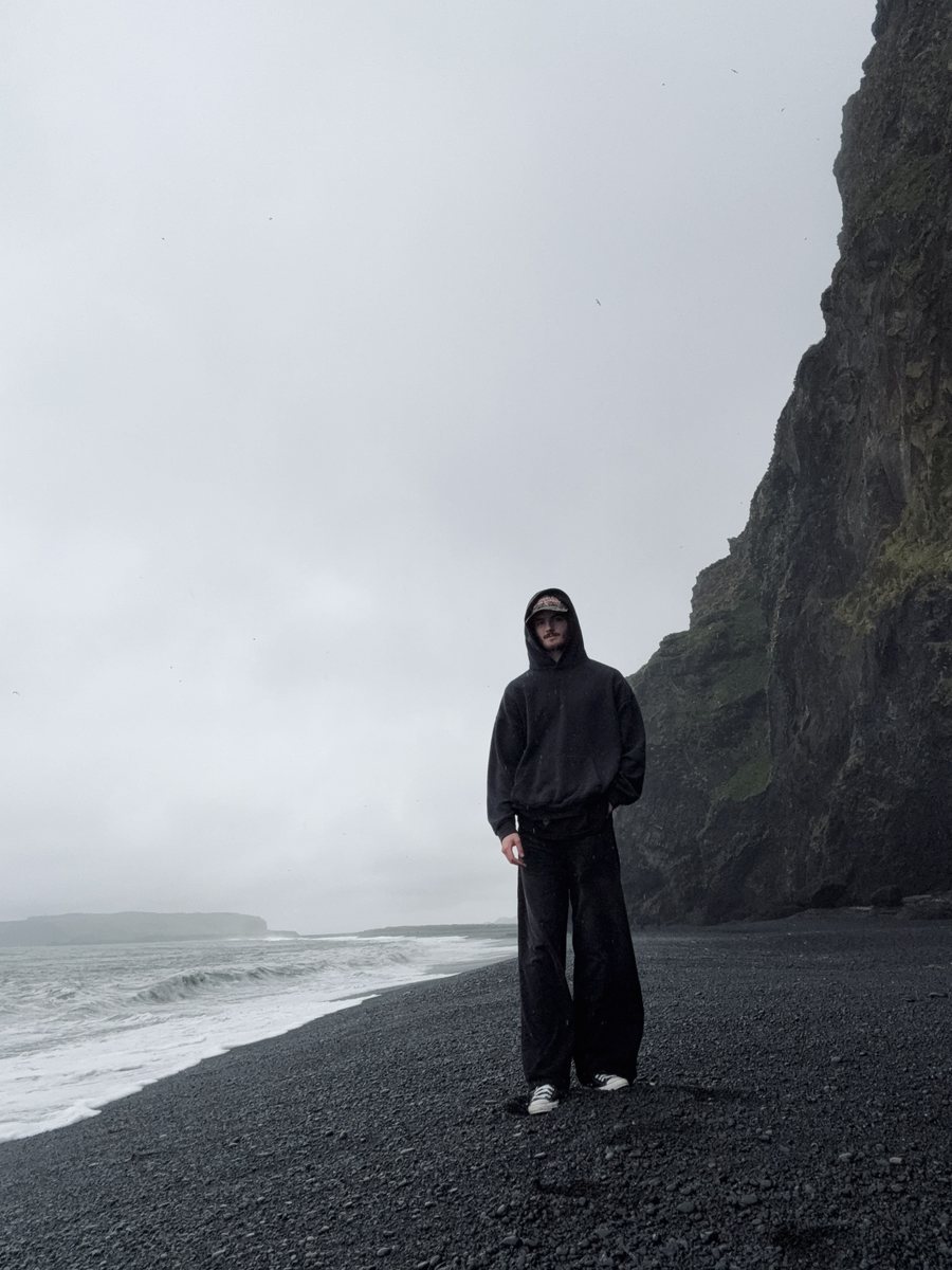
  { id: 'iceland', name: 'Iceland', year: '2025', lon: -18.1, lat: 64.9,
    blurb: 'Completed a solo van journey along the Iceland Ring Road over the course of a week. Navigated remote landscapes, volcanic terrain, and coastal cliffs entirely independently, an exercise in self-reliance, adaptability, and finding stillness in unfamiliar places.' },
  { id: 'guatemala', name: 'Guatemala', year: '2025', lon: -90.4, lat: 15.5,
    blurb: 'Joined a Teams Commissioned for Christ International mission, contributing to construction projects, painting, and community outreach. Worked alongside a diverse team in a rural setting, focused on practical service and building connections across language and culture.' },
];

// Build an SVG path 'd' from a GeoJSON geometry (Polygon | MultiPolygon),
// projected with the same equirectangular mapping the dots use — so any
// pin at a given lat/long always lands on its landmass.
function tvGeoPath(geom) {
  if (!geom) return '';
  // Break a ring wherever consecutive points jump more than half the map
  // width in projected X — i.e. an antimeridian (±180°) crossing. Without
  // this, polygons like Russia draw a straight line clear across the map.
  const ring = (r) => {
    let d = '', px = null;
    for (let k = 0; k < r.length; k++) {
      const X = tvX(r[k][0]), Y = tvY(r[k][1]);
      const cmd = (k === 0 || (px !== null && Math.abs(X - px) > TV_W / 2)) ? 'M' : 'L';
      d += cmd + X.toFixed(1) + ' ' + Y.toFixed(1) + ' ';
      px = X;
    }
    return d + 'Z';
  };
  if (geom.type === 'Polygon') return geom.coordinates.map(ring).join(' ');
  if (geom.type === 'MultiPolygon') return geom.coordinates.map((p) => p.map(ring).join(' ')).join(' ');
  return '';
}
// Real country geometry (Natural Earth 1:50m), fetched at runtime from a
// CORS-enabled CDN as TopoJSON (compact) and decoded with topojson-client.
// The coarse outlines below stand in until it arrives / if it fails.
const TV_GEO_URL = 'https://cdn.jsdelivr.net/npm/world-atlas@2/countries-50m.json';

function TravelDrawer() {
  const [open, setOpen] = React.useState(false);
  const [activeIdx, setActiveIdx] = React.useState(null);  // null = overview (full world)
  const [geo, setGeo] = React.useState(null);              // GeoJSON features once fetched
  const [lightbox, setLightbox] = React.useState(false);   // photo lightbox open
  const [hover, setHover] = React.useState(false);         // hovering the active country shape
  const [tip, setTip] = React.useState({ x: 0, y: 0 });    // tooltip position
  const [lbPos, setLbPos] = React.useState({ sx: 0, sy: 0, below: true, right: true });
  const [closing, setClosing] = React.useState(false);   // lightbox closing animation
  const [cardPos, setCardPos] = React.useState({ left: 0, top: 0 });
  const svgRef = React.useRef(null);
  const frameRef = React.useRef(null);
  const pinRefs = React.useRef([]);
  const viewRef = React.useRef({ x: 0, y: 0, w: TV_W, h: TV_H });
  const rafRef = React.useRef(0);
  const cardRef = React.useRef(null);

  // Travel pins come from the admin (D.travels); fall back to the built-ins.
  const travels = (Array.isArray(D.travels) && D.travels.length) ? D.travels : TRAVELS;
  const n = travels.length;
  const ZOOM = 2.4;   // gentle regional zoom — not drastic
  const detail = activeIdx != null;

  // Fetch + decode the high-detail world (TopoJSON → GeoJSON features).
  React.useEffect(() => {
    let alive = true;
    fetch(TV_GEO_URL).then((r) => r.json()).then((j) => {
      if (!alive) return;
      let feats = null;
      if (window.topojson && j && j.objects && j.objects.countries) {
        feats = window.topojson.feature(j, j.objects.countries).features;
      } else if (j && j.features) { feats = j.features; }
      if (feats) setGeo(feats);
    }).catch(() => { /* keep the coarse fallback */ });
    return () => { alive = false; };
  }, []);

  // Land paths + a name→path lookup used to highlight the active country.
  const paths = React.useMemo(() => (geo ? geo.map((f) => tvGeoPath(f.geometry)) : null), [geo]);
  const byName = React.useMemo(() => {
    const m = {};
    if (geo) geo.forEach((f) => {
      const nm = f.properties && (f.properties.name || f.properties.NAME);
      if (nm) m[String(nm).toLowerCase()] = tvGeoPath(f.geometry);
    });
    return m;
  }, [geo]);

  const cur = detail ? travels[Math.min(activeIdx, n - 1)] : null;
  const highlightD = cur ? byName[(cur.name || '').toLowerCase()] : null;

  const select = (i) => { setLightbox(false); setClosing(false); setHover(false); setActiveIdx((i + n) % n); };
  const viewAll = () => { setLightbox(false); setClosing(false); setHover(false); setActiveIdx(null); };
  // Open the photo card anchored to the active country's on-screen point.
  const openLightbox = () => {
    const fr = frameRef.current;
    if (fr && cur) {
      const W = fr.clientWidth, H = fr.clientHeight;
      const { x, y, w, h } = viewRef.current;
      const s = Math.max(W / w, H / h);
      const sx = W / 2 + (tvX(cur.lon) - (x + w / 2)) * s;
      const sy = H / 2 + (tvY(cur.lat) - (y + h / 2)) * s;
      setLbPos({ sx, sy, below: sy < H / 2, right: sx < W / 2 });
    }
    setLightbox(true); setClosing(false);
  };

  // Close the photo card.
  const closeLightbox = () => { setLightbox(false); setClosing(false); };

  // Clamp the photo card fully inside the visible map, anchored toward center.
  const placeCard = React.useCallback(() => {
    const fr = frameRef.current, card = cardRef.current;
    if (!fr || !card) return;
    const W = fr.clientWidth, H = fr.clientHeight, cw = card.offsetWidth, ch = card.offsetHeight, pad = 10;
    let left = lbPos.right ? lbPos.sx + 16 : lbPos.sx - 16 - cw;
    let top = lbPos.below ? lbPos.sy + 16 : lbPos.sy - 16 - ch;
    left = Math.max(pad, Math.min(Math.max(pad, W - cw - pad), left));
    top = Math.max(pad, Math.min(Math.max(pad, H - ch - pad), top));
    setCardPos({ left, top });
  }, [lbPos]);
  React.useLayoutEffect(() => { if (lightbox) placeCard(); }, [lightbox, cur, placeCard]);

  // Position the HTML pins by projecting lon/lat through the CURRENT viewBox
  // (so they stay a constant on-screen size at any zoom and pan with the map).
  const placeMarkers = React.useCallback(() => {
    const fr = frameRef.current; if (!fr) return;
    const W = fr.clientWidth, H = fr.clientHeight;
    const { x, y, w, h } = viewRef.current;
    // Detail (zoomed) views fill the frame (cover); the overview fits the full
    // world width (contain) so far-east/far-west pins are never cropped.
    const s = detail ? Math.max(W / w, H / h) : Math.min(W / w, H / h);
    travels.forEach((t, i) => {
      const el = pinRefs.current[i]; if (!el) return;
      const sx = W / 2 + (tvX(t.lon) - (x + w / 2)) * s;
      const sy = H / 2 + (tvY(t.lat) - (y + h / 2)) * s;
      el.style.left = sx + 'px';
      el.style.top = sy + 'px';
      el.style.display = (sx < -24 || sx > W + 24 || sy < -24 || sy > H + 24) ? 'none' : 'block';
    });
  }, [travels, detail]);

  const viewFor = React.useCallback((i) => {
    const t = travels[i]; const zw = TV_W / ZOOM, zh = TV_H / ZOOM;
    return { x: tvX(t.lon) - zw / 2, y: tvY(t.lat) - zh / 2, w: zw, h: zh };
  }, [travels]);

  const animateView = React.useCallback((target, dur = 640) => {
    cancelAnimationFrame(rafRef.current);
    const from = { ...viewRef.current };
    const t0 = performance.now();
    const ease = (t) => (t < 0.5 ? 4 * t * t * t : 1 - Math.pow(-2 * t + 2, 3) / 2);
    const step = (now) => {
      const p = Math.min(1, (now - t0) / dur), e = ease(p);
      const v = {
        x: from.x + (target.x - from.x) * e, y: from.y + (target.y - from.y) * e,
        w: from.w + (target.w - from.w) * e, h: from.h + (target.h - from.h) * e,
      };
      viewRef.current = v;
      if (svgRef.current) svgRef.current.setAttribute('viewBox',
        `${v.x.toFixed(2)} ${v.y.toFixed(2)} ${v.w.toFixed(2)} ${v.h.toFixed(2)}`);
      placeMarkers();
      if (p < 1) rafRef.current = requestAnimationFrame(step);
    };
    rafRef.current = requestAnimationFrame(step);
  }, [placeMarkers]);

  // Reset to overview (full world) when the drawer closes.
  React.useEffect(() => {
    if (open) return;
    setActiveIdx(null); setLightbox(false); setClosing(false); setHover(false);
    cancelAnimationFrame(rafRef.current);
    viewRef.current = { x: 0, y: 0, w: TV_W, h: TV_H };
    if (svgRef.current) svgRef.current.setAttribute('viewBox', `0 0 ${TV_W} ${TV_H}`);
  }, [open]);

  // Animate the map to the overview (full world) or the active region.
  React.useEffect(() => {
    if (!open) return;
    animateView(detail ? viewFor(activeIdx) : { x: 0, y: 0, w: TV_W, h: TV_H });
  }, [open, activeIdx, detail, animateView, viewFor]);

  // Keep pins aligned after layout settles + on resize.
  React.useEffect(() => {
    if (!open) return;
    const id = setTimeout(placeMarkers, 60);
    window.addEventListener('resize', placeMarkers);
    return () => { clearTimeout(id); window.removeEventListener('resize', placeMarkers); };
  }, [open, activeIdx, geo, placeMarkers]);

  React.useEffect(() => () => cancelAnimationFrame(rafRef.current), []);

  // ESC closes the photo lightbox.
  React.useEffect(() => {
    if (!lightbox) return;
    const onKey = (e) => { if (e.key === 'Escape') closeLightbox(); };
    window.addEventListener('keydown', onKey);
    return () => window.removeEventListener('keydown', onKey);
  }, [lightbox]);

  return (
    <div style={{ marginTop: 64 }}>
      <style>{`
        @keyframes cg-tv-bob { 0%,100% { transform: translateY(0); } 50% { transform: translateY(3px); } }
        @keyframes cg-tv-slidein { from { opacity: 0; transform: translateX(40px); } to { opacity: 1; transform: none; } }
        @keyframes cg-tv-ping { 0% { transform: translate(-50%,-50%) scale(1); opacity: 0.55; } 70% { opacity: 0; } 100% { transform: translate(-50%,-50%) scale(3.4); opacity: 0; } }
        .cg-tv-trigger { cursor: pointer; background: none; border: 0; padding: 0;
          display: inline-flex; align-items: center; gap: 12px;
          font-family: var(--ui-font); font-size: 12px; letter-spacing: 0.32em;
          text-transform: uppercase; color: var(--amber); font-weight: 500;
          padding-bottom: 6px; border-bottom: 1px solid var(--amber);
          transition: color .3s ease, border-color .3s ease; }
        .cg-tv-trigger:hover { color: var(--amber-light, #f5cd6a); }
        .cg-tv-chev { transition: transform .6s cubic-bezier(.2,.7,.3,1); }
        .cg-tv-trigger:not(.is-open) .cg-tv-chev { animation: cg-tv-bob 1.8s ease-in-out infinite; }
        .cg-tv-trigger.is-open .cg-tv-chev { transform: rotate(180deg); }
        /* Stage: grid that animates from full-width map → split */
        .cg-tv-stage { display: grid; grid-template-columns: 1fr 0fr; column-gap: 0; align-items: stretch; position: relative;
          margin-top: 40px; }
        .cg-tv-stage.is-detail { grid-template-columns: 1.3fr 1fr; column-gap: 24px; }
        .cg-tv-left { display: flex; flex-direction: column; min-width: 0; height: 520px; }
        .cg-tv-mapframe { position: relative; flex: 1; min-height: 260px; background: #080604; overflow: visible;
          border: 1px solid #3d2a10; box-shadow: inset 0 0 0 1px rgba(0,0,0,0.5), inset 0 0 70px rgba(0,0,0,0.5); }
        /* HTML pins (constant size, tracked to the zoom) */
        .cg-tv-markers { position: absolute; inset: 0; pointer-events: none; z-index: 4; }
        .cg-tv-pin { position: absolute; width: 24px; height: 24px; transform: translate(-50%,-50%);
          pointer-events: all; cursor: pointer; }
        .cg-tv-dot { position: absolute; left: 50%; top: 50%; width: 11px; height: 11px; border-radius: 50%;
          transform: translate(-50%,-50%); background: #c8821e;
          box-shadow: 0 0 10px 2px rgba(200,130,30,0.6), 0 0 0 3px rgba(200,130,30,0.12); transition: background .25s, box-shadow .25s; }
        .cg-tv-pin:hover .cg-tv-dot { box-shadow: 0 0 14px 3px rgba(244,200,105,0.85), 0 0 0 5px rgba(244,200,105,0.16); }
        .cg-tv-dot.on { background: #f4c869; box-shadow: 0 0 16px 4px rgba(244,200,105,0.85), 0 0 0 5px rgba(244,200,105,0.2); }
        .cg-tv-pin:hover .cg-tv-dot.lb-open { filter: brightness(0.72); box-shadow: 0 0 7px 1px rgba(200,130,30,0.45), 0 0 0 4px rgba(200,130,30,0.12); }
        .cg-tv-ring { position: absolute; left: 50%; top: 50%; width: 11px; height: 11px; border-radius: 50%;
          border: 1px solid rgba(200,130,30,0.85); transform: translate(-50%,-50%);
          animation: cg-tv-ping 2.5s ease-out infinite; pointer-events: none; }
        /* View-all button (top-left of the map, split view only) */
        .cg-tv-viewall { position: absolute; top: 12px; left: 12px; z-index: 6; display: inline-flex; align-items: center; gap: 7px;
          background: rgba(13,9,5,0.78); border: 1px solid rgba(217,154,61,0.45); color: var(--amber); cursor: pointer;
          font-family: var(--ui-font); font-size: 9.5px; letter-spacing: 0.2em; text-transform: uppercase;
          padding: 8px 12px; border-radius: 2px; backdrop-filter: blur(2px);
          transition: background .2s ease, border-color .2s ease; }
        .cg-tv-viewall:hover { background: rgba(13,9,5,0.95); border-color: var(--amber); }
        /* Country tabs (below the map) */
        .cg-tv-tabs { display: flex; flex-wrap: wrap; gap: 8px; margin-top: 14px; }
        .cg-tv-caption + .cg-tv-tabs { margin-top: 8px; }
        .cg-tv-tab { background: none; border: 1px solid var(--card-edge); cursor: pointer; padding: 9px 16px;
          border-radius: 2px; font-family: var(--ui-font); font-size: 10px; letter-spacing: 0.2em;
          text-transform: uppercase; color: var(--ink-mute);
          transition: color .2s ease, border-color .2s ease, background .2s ease; }
        .cg-tv-tab:hover { color: var(--ink-soft); border-color: var(--rule-strong); }
        .cg-tv-tab.is-on { color: #1a120b; background: var(--amber); border-color: var(--amber); font-weight: 600; }
        .cg-tv-caption { margin-top: 12px; text-align: left; font-family: var(--ui-font); font-size: 11px;
          letter-spacing: 0.3em; text-transform: uppercase; color: var(--amber); opacity: 0.82; }
        /* Info panel */
        .cg-tv-info { min-width: 0; overflow: hidden; display: flex; height: 520px;
          background: #160e07; border: 1px solid rgba(217,154,61,0.22); box-shadow: var(--shadow); }
        .cg-tv-stage:not(.is-detail) .cg-tv-info { border-color: transparent; background: none; box-shadow: none; }
        .cg-tv-info-inner { width: 100%; min-width: 300px; padding: 32px; display: flex; flex-direction: column; }
        .cg-tv-place { font-family: var(--display-font); font-weight: 500; font-size: 46px; line-height: 1.02;
          letter-spacing: -0.02em; color: var(--amber); margin: 0 0 18px; }
        .cg-tv-desc { font-family: var(--body-font); font-size: 15px; line-height: 1.72; color: var(--ink-soft); margin: 0; }
        .cg-tv-viewphoto { margin-top: 24px; align-self: flex-start; background: none; border: 0; padding: 0 0 3px;
          cursor: pointer; display: inline-flex; align-items: center; gap: 8px; font-family: var(--ui-font);
          font-size: 11px; letter-spacing: 0.26em; text-transform: uppercase; color: var(--amber);
          border-bottom: 1px solid transparent; transition: border-color .25s ease, color .25s ease; }
        .cg-tv-viewphoto:hover { border-bottom-color: var(--amber); color: var(--amber-light, #f5cd6a); }
        .cg-tv-tip { position: absolute; z-index: 6; pointer-events: none; transform: translateY(-50%);
          background: rgba(13,9,5,0.82); border: 1px solid rgba(217,154,61,0.4); color: var(--amber);
          font-family: var(--ui-font); font-size: 9px; letter-spacing: 0.22em; text-transform: uppercase;
          padding: 5px 9px; white-space: nowrap; }
        .cg-tv-lb { position: absolute; inset: 0; z-index: 20; background: transparent; }
        .cg-tv-lb-card { position: absolute; cursor: default; transform: rotate(2.5deg); }
        @keyframes cg-tv-lbpop { from { transform: scale(0.1) rotate(2.5deg); opacity: 0; } to { transform: scale(1) rotate(2.5deg); opacity: 1; } }
        @keyframes cg-tv-lbpop-out { from { transform: scale(1) rotate(2.5deg); opacity: 1; } to { transform: scale(0.1) rotate(2.5deg); opacity: 0; } }
        .cg-tv-lb-card img { display: block; width: 220px; height: auto; border: 1px solid #c8821e;
          box-shadow: 0 4px 20px rgba(0,0,0,0.7); }
        .cg-tv-lb-empty { width: 220px; height: 160px; border: 1px solid #c8821e; box-shadow: 0 4px 20px rgba(0,0,0,0.7);
          background: #0d0905; display: flex; align-items: center; justify-content: center;
          color: rgba(217,154,61,0.4); font-size: 26px; }
        .cg-tv-lb-pin { position: absolute; width: 9px; height: 9px; border-radius: 50%; background: #c8821e;
          transform: translate(-50%,-50%); box-shadow: 0 0 8px 2px rgba(200,130,30,0.7); pointer-events: none; z-index: 1; }
      `}</style>

      {/* Trigger */}
      <div style={{ textAlign: 'center' }}>
        <button className={'cg-tv-trigger' + (open ? ' is-open' : '')}
          aria-expanded={open} onClick={() => setOpen((o) => !o)}>
          Explore My Travels
          <svg className="cg-tv-chev" width="14" height="9" viewBox="0 0 14 9" fill="none"
            aria-hidden="true">
            <path d="M1 1.5L7 7.5L13 1.5" stroke="currentColor" strokeWidth="1.5"
              strokeLinecap="round" strokeLinejoin="round" />
          </svg>
        </button>
      </div>

      {/* Drawer */}
      <div style={{ maxHeight: open ? 1240 : 0, overflow: 'hidden',
        transition: 'max-height .6s cubic-bezier(.4,0,.2,1)' }}>
        <div className={'cg-tv-stage' + (detail ? ' is-detail' : '')}>
          {/* LEFT — map + tabs (+ caption in overview) */}
          <div className="cg-tv-left">
            <div className="cg-tv-mapframe" ref={frameRef}>
              <svg ref={svgRef} viewBox={`0 0 ${TV_W} ${TV_H}`} preserveAspectRatio={detail ? 'xMidYMid slice' : 'xMidYMid meet'}
                style={{ position: 'absolute', inset: 0, width: '100%', height: '100%', display: 'block' }}>
                <defs>
                  <radialGradient id="cgTvLand" cx="50%" cy="46%" r="72%">
                    <stop offset="0%" stopColor="#241b0f" />
                    <stop offset="62%" stopColor="#1f160c" />
                    <stop offset="100%" stopColor="#18110a" />
                  </radialGradient>
                  <radialGradient id="cgTvVig" cx="50%" cy="50%" r="80%">
                    <stop offset="60%" stopColor="#050302" stopOpacity="0" />
                    <stop offset="100%" stopColor="#050302" stopOpacity="0.4" />
                  </radialGradient>
                </defs>
                <rect x="0" y="0" width={TV_W} height={TV_H} fill="#080604" />
                <g fill="url(#cgTvLand)" stroke="#2a1c0a" strokeWidth="0.4" strokeOpacity="0.5"
                  strokeLinejoin="round" vectorEffect="non-scaling-stroke">
                  {paths
                    ? paths.map((d, i) => <path key={i} d={d} fillRule="evenodd" />)
                    : TV_LANDS.map((ring, i) => (
                        <polygon key={i}
                          points={ring.map(([lon, lat]) => `${tvX(lon).toFixed(1)},${tvY(lat).toFixed(1)}`).join(' ')} />
                      ))}
                </g>
                {highlightD && (
                  <path d={highlightD} fillRule="evenodd" className="cg-tv-country"
                    fill={hover ? '#f4c869' : '#d99a3d'} fillOpacity={hover ? 0.55 : 0.34}
                    stroke="#f4c869" strokeWidth={hover ? 1.4 : 1} strokeOpacity="0.95" vectorEffect="non-scaling-stroke"
                    onClick={() => (lightbox ? closeLightbox() : openLightbox())}
                    onMouseEnter={() => setHover(true)}
                    onMouseLeave={() => setHover(false)}
                    onMouseMove={(e) => { const r = frameRef.current && frameRef.current.getBoundingClientRect(); if (r) setTip({ x: e.clientX - r.left, y: e.clientY - r.top }); }}
                    style={{ cursor: 'pointer', pointerEvents: 'all', filter: hover ? 'drop-shadow(0 0 5px rgba(244,200,105,0.95))' : 'drop-shadow(0 0 2px rgba(244,200,105,0.7))' }} />
                )}
                <rect x="0" y="0" width={TV_W} height={TV_H} fill="url(#cgTvVig)" pointerEvents="none" />
              </svg>

              {/* HTML pins */}
              <div className="cg-tv-markers">
                {travels.map((t, i) => {
                  const act = detail && i === activeIdx;
                  return (
                    <div key={i} ref={(el) => (pinRefs.current[i] = el)} className="cg-tv-pin"
                      style={{ display: 'none' }} aria-label={act ? (lightbox ? 'Close photo' : 'View photo') : t.name}
                      onClick={() => (act ? (lightbox ? closeLightbox() : openLightbox()) : select(i))}
                      onMouseEnter={act ? () => setHover(true) : undefined}
                      onMouseLeave={act ? () => setHover(false) : undefined}
                      onMouseMove={act ? (e) => { const r = frameRef.current && frameRef.current.getBoundingClientRect(); if (r) setTip({ x: e.clientX - r.left, y: e.clientY - r.top }); } : undefined}>
                      <span className="cg-tv-ring" />
                      <span className={'cg-tv-dot' + (activeIdx === i ? ' on' : '') + (act && lightbox ? ' lb-open' : '')} />
                    </div>
                  );
                })}
              </div>

              {detail && (
                <button className="cg-tv-viewall" onClick={viewAll} aria-label="Back to the world map">
                  <svg width="11" height="11" viewBox="0 0 12 12" fill="none"><circle cx="6" cy="6" r="5"
                    stroke="currentColor" strokeWidth="1.2" /><path d="M1 6h10M6 1c1.6 1.4 1.6 8.6 0 10M6 1c-1.6 1.4-1.6 8.6 0 10"
                    stroke="currentColor" strokeWidth="0.9" /></svg>
                  View All
                </button>
              )}
              {detail && hover && (
                <div className="cg-tv-tip" style={{ left: tip.x + 15, top: tip.y + 16, opacity: lightbox ? 0.7 : 1 }}>{lightbox ? 'Close' : 'View Photo'}</div>
              )}
            </div>

            {!detail && <div className="cg-tv-caption">Select a destination</div>}

            <div className="cg-tv-tabs">
              {travels.map((t, i) => (
                <button key={i} className={'cg-tv-tab' + (activeIdx === i ? ' is-on' : '')}
                  onClick={() => select(i)}>{t.name}</button>
              ))}
            </div>
          </div>

          {/* RIGHT — destination info (slides in) */}
          <div className="cg-tv-info">
            {cur && (
              <div className="cg-tv-info-inner" key={activeIdx}>
                <h3 className="cg-tv-place">{cur.name}</h3>
                <p className="cg-tv-desc">{cur.blurb}</p>
                <button className="cg-tv-viewphoto" onClick={openLightbox} aria-label="View photo">
                  <svg width="14" height="14" viewBox="0 0 24 24" fill="none" stroke="currentColor"
                    strokeWidth="1.7" strokeLinejoin="round" strokeLinecap="round">
                    <rect x="2.5" y="6.5" width="19" height="13" rx="2" />
                    <path d="M8 6.5l1.6-2.2h4.8L16 6.5" />
                    <circle cx="12" cy="13" r="3.4" />
                  </svg>
                  View Photo
                </button>
              </div>
            )}
          </div>

          {lightbox && cur && (
            <div className="cg-tv-lb" onClick={closeLightbox}
              style={{ cursor: hover ? 'pointer' : 'default' }}
              onMouseMove={(e) => { const r = frameRef.current && frameRef.current.getBoundingClientRect(); if (r) setTip({ x: e.clientX - r.left, y: e.clientY - r.top }); const overCountry = document.elementsFromPoint(e.clientX, e.clientY).some((el) => el.classList && el.classList.contains('cg-tv-country')); setHover(overCountry); }}>
              <span className="cg-tv-lb-pin" style={{ left: lbPos.sx, top: lbPos.sy }} />
              <div ref={cardRef} className="cg-tv-lb-card"
                onClick={(e) => e.stopPropagation()}
                onMouseMove={(e) => { e.stopPropagation(); setHover(false); }}
                style={{ left: cardPos.left, top: cardPos.top,
                  transformOrigin: `${lbPos.sx - cardPos.left}px ${lbPos.sy - cardPos.top}px` }}>
                {cur.image
                  ? <img src={cur.image} alt={cur.name} onLoad={placeCard} />
                  : <div className="cg-tv-lb-empty">◆</div>}
              </div>
            </div>
          )}
        </div>
      </div>
    </div>
  );
}

// ── Resume — cinema-credits feel ───────────────────────────────────
function Resume() {
  return (
    <section id="sec-resume" style={{ position: 'relative', padding: '160px 80px',
      background: 'var(--bg-deep)', overflow: 'hidden' }}>
      <div className="cg-candlelight" style={{ top: '50%', left: '50%',
        transform: 'translate(-50%, -50%)', width: 800, height: 800, opacity: 0.25 }} />

      <div style={{ position: 'relative', zIndex: 2, maxWidth: 1100, margin: '0 auto' }}>
        <header className="cg-reveal" style={{ textAlign: 'center', marginBottom: 90 }}>
          <span className="cg-eyebrow">Field Journal · A short history</span>
          <h2 style={{ fontFamily: 'var(--display-font)', fontWeight: 500,
            fontSize: 88, lineHeight: 1, letterSpacing: '-0.02em',
            margin: '20px 0 24px', color: 'var(--ink)' }}>
            Where I&rsquo;ve <span style={{ fontStyle: 'italic', fontWeight: 400 }}>been</span>.
          </h2>
          <BotanicalDivider width={320} style={{ margin: '0 auto' }} />
        </header>

        <div className="cg-reveal" style={{ position: 'relative', transitionDelay: '.1s' }}>
          {/* timeline rail — center for cinematic balance? no, left for readability */}
          <div className="cg-resume-rail" style={{ position: 'absolute', left: 144, top: 6, bottom: 6, width: 1,
            background: 'var(--rule)' }} />
          {D.resume.map((r, i) => (
            <div key={i} style={{ position: 'relative', marginBottom: 56,
              paddingBottom: 40, borderBottom: i < D.resume.length - 1 ? '1px solid var(--rule)' : 'none' }}>
              <div className="cg-resume-row" style={{ display: 'grid', gridTemplateColumns: '128px 1fr', gap: 60, alignItems: 'baseline' }}>
                {/* dates column */}
                <div style={{ paddingTop: 8, textAlign: 'right' }}>
                  <div style={{ fontFamily: 'var(--ui-font)', fontSize: 11,
                    letterSpacing: '0.22em', textTransform: 'uppercase',
                    color: 'var(--amber)', fontWeight: 500, marginBottom: 8 }}>{r.dates}</div>
                  <div style={{ fontFamily: 'var(--body-font)', fontSize: 13,
                    color: 'var(--ink-mute)', fontStyle: 'italic' }}>{r.city}</div>
                </div>

                {/* timeline dot — sits on the rail */}
                <div className="cg-resume-dot" style={{ position: 'absolute', left: 138, top: 14,
                  width: 13, height: 13, borderRadius: '50%',
                  background: 'var(--bg-deep)', border: '1px solid var(--amber)',
                  boxShadow: '0 0 0 5px var(--bg-deep), 0 0 14px var(--amber-glow)' }} />

                {/* role/company column */}
                <div className="cg-resume-body" style={{ paddingLeft: 32 }}>
                  <h3 style={{ fontFamily: 'var(--display-font)', fontWeight: 500,
                    fontSize: 32, lineHeight: 1.15, letterSpacing: '-0.015em',
                    margin: '0 0 6px', color: 'var(--ink)' }}>{r.role}</h3>
                  <div style={{ fontFamily: 'var(--display-font)', fontSize: 17,
                    color: 'var(--ink-soft)', fontStyle: 'italic', marginBottom: 18 }}>
                    {r.company}
                  </div>
                  <ul style={{ margin: 0, padding: 0, listStyle: 'none' }}>
                    {r.bullets.map((b, j) => (
                      <li key={j} style={{ fontFamily: 'var(--body-font)', fontSize: 15,
                        lineHeight: 1.7, color: 'var(--ink-soft)', marginBottom: 8,
                        paddingLeft: 22, position: 'relative' }}>
                        <span style={{ position: 'absolute', left: 0, top: 12, width: 12, height: 1,
                          background: 'var(--ink-dim)' }} />
                        {b}
                      </li>
                    ))}
                  </ul>
                </div>
              </div>
            </div>
          ))}
        </div>

        <TravelDrawer />
      </div>
    </section>
  );
}

// ── Contact ────────────────────────────────────────────────────────
function Contact() {
  const [state, setState] = React.useState({ name: '', email: '', message: '' });
  const [sent, setSent] = React.useState(false);
  const [sending, setSending] = React.useState(false);
  const [errors, setErrors] = React.useState({});
  const [sendErr, setSendErr] = React.useState('');

  async function submit(e) {
    e.preventDefault();
    const errs = {};
    if (!state.name.trim()) errs.name = 'A name, please.';
    if (!/^[^@\s]+@[^@\s]+\.[^@\s]+$/.test(state.email)) errs.email = 'A working email helps me write back.';
    if (!state.message.trim()) errs.message = 'A message, please.';
    setErrors(errs);
    if (Object.keys(errs).length > 0) return;

    setSending(true); setSendErr('');
    try {
      const res = await fetch('/api/contact', {
        method: 'POST',
        headers: { 'Content-Type': 'application/json' },
        body: JSON.stringify(state),
      });
      if (!res.ok) throw new Error('send failed');
      setSent(true);
    } catch (e2) {
      setSendErr('Could not send just now — try again, or email me directly below.');
    }
    setSending(false);
  }

  const field = (label, key, type = 'text', rows = 0) => (
    <label style={{ display: 'block', marginBottom: 32 }}>
      <div style={{ fontFamily: 'var(--ui-font)', fontSize: 10,
        letterSpacing: '0.3em', textTransform: 'uppercase',
        color: 'var(--ink-mute)', marginBottom: 12 }}>{label}</div>
      {rows ? (
        <textarea value={state[key]} rows={rows}
          onChange={(e) => setState({ ...state, [key]: e.target.value })}
          style={{ width: '100%', background: 'transparent',
            border: 'none', borderBottom: `1px solid ${errors[key] ? 'var(--terracotta)' : 'var(--rule-strong)'}`,
            fontFamily: 'var(--display-font)', fontSize: 22, lineHeight: 1.5,
            color: 'var(--ink)', padding: '10px 0', resize: 'none', outline: 'none' }} />
      ) : (
        <input value={state[key]} type={type}
          onChange={(e) => setState({ ...state, [key]: e.target.value })}
          style={{ width: '100%', background: 'transparent',
            border: 'none', borderBottom: `1px solid ${errors[key] ? 'var(--terracotta)' : 'var(--rule-strong)'}`,
            fontFamily: 'var(--display-font)', fontSize: 24,
            color: 'var(--ink)', padding: '10px 0', outline: 'none' }} />
      )}
      {errors[key] && <div style={{ fontFamily: 'var(--body-font)', fontStyle: 'italic',
        fontSize: 13, color: 'var(--terracotta)', marginTop: 8 }}>{errors[key]}</div>}
    </label>
  );

  return (
    <section id="sec-contact" style={{ position: 'relative', padding: '160px 80px 100px',
      background: 'var(--bg)', overflow: 'hidden' }}>
      <div className="cg-candlelight" style={{ top: '-15%', left: '50%',
        transform: 'translateX(-50%)', width: 900, height: 700, opacity: 0.45 }} />

      {/* Two loose sprigs bleeding off the upper corners */}
      <div className="cg-botanical" style={{ position: 'absolute', top: 40, left: -40, pointerEvents: 'none', zIndex: 1, transitionDelay: '.1s' }}>
        <LooseSprig size={240} opacity={0.45} />
      </div>
      <div className="cg-botanical" style={{ position: 'absolute', top: 40, right: -40, pointerEvents: 'none', zIndex: 1, transitionDelay: '.25s' }}>
        <LooseSprig size={240} opacity={0.45} flip />
      </div>

      <div style={{ position: 'relative', zIndex: 2, maxWidth: 900, margin: '0 auto' }}>
        {sent ? (
          <div style={{ textAlign: 'center', padding: '60px 0', position: 'relative', zIndex: 2 }}>
            <div className="cg-divider" style={{ width: 220 }}>
              <span className="line" style={{ background: 'var(--amber)' }} />
              <span className="dot" />
              <span className="line" style={{ background: 'var(--amber)' }} />
            </div>
            <h3 style={{ fontFamily: 'var(--display-font)', fontSize: 48, fontWeight: 500,
              color: 'var(--ink)', margin: '36px 0 16px',
              letterSpacing: '-0.015em' }}>Thank you, {state.name.split(' ')[0]}.</h3>
            <p style={{ fontFamily: 'var(--body-font)', fontSize: 17, fontStyle: 'italic',
              color: 'var(--ink-soft)', maxWidth: 480, marginInline: 'auto', lineHeight: 1.7 }}>
              Your letter&rsquo;s on its way. I&rsquo;ll write back within the week, usually sooner.
            </p>
          </div>
        ) : (
          <React.Fragment>
          <header className="cg-reveal" style={{ textAlign: 'center', marginBottom: 70 }}>
            <span className="cg-eyebrow">Get in touch</span>
            <h2 style={{ fontFamily: 'var(--display-font)', fontWeight: 500,
              fontSize: 96, lineHeight: 0.95, letterSpacing: '-0.02em',
              margin: '20px 0 28px', color: 'var(--ink)' }}>
              Write me a <span style={{ fontStyle: 'italic', fontWeight: 400 }}>letter</span>.
            </h2>
            <p style={{ fontFamily: 'var(--body-font)', fontSize: 18, fontStyle: 'italic',
              color: 'var(--ink-soft)', margin: 0, maxWidth: 540, marginInline: 'auto', lineHeight: 1.65 }}>
              Project ideas, collaborations, or just a kind word. I read everything that comes in,
              and I write back the same week.
            </p>
          </header>

          <form onSubmit={submit} style={{ maxWidth: 700, marginInline: 'auto' }}>
            <div className="cg-contact-grid cg-reveal" style={{ display: 'grid', gridTemplateColumns: '1fr 1fr', gap: 56, transitionDelay: '.1s' }}>
              {field('Your name', 'name')}
              {field('Your email', 'email', 'email')}
            </div>
            {field('Your message', 'message', 'text', 4)}
            {sendErr && <div style={{ fontFamily: 'var(--body-font)', fontStyle: 'italic',
              fontSize: 13.5, color: 'var(--terracotta)', marginTop: -8, marginBottom: 24 }}>{sendErr}</div>}
            <div className="cg-contact-foot" style={{ display: 'flex', alignItems: 'center', justifyContent: 'space-between',
              marginTop: 44, paddingTop: 32, borderTop: '1px solid var(--rule)' }}>
              <p style={{ fontFamily: 'var(--body-font)', fontStyle: 'italic', fontSize: 14,
                color: 'var(--ink-mute)', margin: 0, maxWidth: 340 }}>
                Or, if it&rsquo;s easier: <a href={`mailto:${D.email}`}
                  style={{ color: 'var(--amber)', textDecoration: 'none', borderBottom: '1px solid currentColor' }}>{D.email}</a>
              </p>
              <button type="submit" className="cg-send" disabled={sending} style={{
                background: 'transparent', color: 'var(--ink)',
                border: '1px solid var(--amber)', padding: '18px 36px', cursor: sending ? 'wait' : 'pointer',
                opacity: sending ? 0.6 : 1,
                fontFamily: 'var(--ui-font)', fontSize: 11,
                letterSpacing: '0.3em', textTransform: 'uppercase',
                fontWeight: 500, transition: 'background .3s ease, color .3s ease',
              }}>{sending ? 'Sending…' : <React.Fragment>Send it off &rarr;</React.Fragment>}</button>
            </div>
          </form>
          </React.Fragment>
        )}

        <div style={{ marginTop: 110, textAlign: 'center',
          fontFamily: 'var(--display-font)', fontStyle: 'italic', fontSize: 24,
          color: 'var(--ink-soft)' }}>
          {THEME.closing}
        </div>
      </div>
    </section>
  );
}

// ── Social platform glyphs (simple parlor-line marks) ───────────────
function SocialGlyph({ kind }) {
  const p = { width: 26, height: 26, viewBox: '0 0 24 24', fill: 'none',
    stroke: 'currentColor', strokeWidth: 1.6, strokeLinecap: 'round', strokeLinejoin: 'round' };
  if (kind === 'tiktok') return (
    <svg {...p}><path d="M9 8.5a4 4 0 1 0 4 4V3c.8 1.9 2.4 3.2 4.5 3.4" /></svg>
  );
  if (kind === 'instagram') return (
    <svg {...p}><rect x="3" y="3" width="18" height="18" rx="5" /><circle cx="12" cy="12" r="4" /><circle cx="17" cy="7" r="0.6" fill="currentColor" stroke="none" /></svg>
  );
  return ( // youtube
    <svg {...p}><rect x="2.5" y="5.5" width="19" height="13" rx="3.5" /><path d="M10 9.5l5 2.5-5 2.5z" fill="currentColor" stroke="none" /></svg>
  );
}

// Floating "pop-up window" linking out to one social platform.
function SocialWindow({ s, index, total, onClose }) {
  const [hover, setHover] = React.useState(false);
  // fan the windows out around centre with a gentle tilt + stagger
  const mid = (total - 1) / 2;
  const offset = index - mid;
  const tilt = offset * 5;
  const lift = -Math.abs(offset) * 6;
  // Opacity stays 1; entrance is a transform-only CSS animation with no
  // fill-mode, so the resting (inline) tilt transform always applies and
  // the window is never left invisible.
  return (
    <a href={s.url || '#'} target="_blank" rel="noopener noreferrer"
      onClick={(e) => {
        e.stopPropagation();
        if (!s.url) { e.preventDefault(); return; }
        // Prefer a real new tab. If the sandboxed preview blocks popups,
        // window.open returns null — let the anchor's default navigation run.
        const w = window.open(s.url, '_blank', 'noopener');
        if (w) e.preventDefault();
      }}
      onMouseEnter={() => setHover(true)} onMouseLeave={() => setHover(false)}
      style={{ display: 'block', width: 244, textDecoration: 'none',
        transform: `translateY(${lift}px) rotate(${hover ? 0 : tilt}deg) scale(${hover ? 1.035 : 1})`,
        transition: 'transform .3s cubic-bezier(.2,.8,.2,1)',
        animation: `cgWinIn .45s cubic-bezier(.2,.9,.25,1) ${index * 0.08}s` }}>
      <div style={{ background: 'var(--bg-soft)', border: '1px solid var(--card-edge)',
        borderRadius: 7, overflow: 'hidden',
        boxShadow: hover ? '0 26px 60px rgba(0,0,0,0.6)' : '0 16px 40px rgba(0,0,0,0.5)',
        transition: 'box-shadow .3s' }}>
        {/* title bar — little window chrome */}
        <div style={{ display: 'flex', alignItems: 'center', gap: 8, padding: '9px 12px',
          background: 'var(--bg-deep)', borderBottom: '1px solid var(--rule)' }}>
          <span style={{ width: 9, height: 9, borderRadius: '50%', background: 'var(--terracotta)' }} />
          <span style={{ width: 9, height: 9, borderRadius: '50%', background: 'var(--amber-deep)' }} />
          <span style={{ width: 9, height: 9, borderRadius: '50%', background: 'var(--sage)' }} />
          <span style={{ marginLeft: 'auto', fontFamily: 'var(--ui-font)', fontSize: 9.5,
            letterSpacing: '0.18em', textTransform: 'uppercase', color: 'var(--ink-mute)' }}>{s.label}</span>
        </div>
        {/* body */}
        <div style={{ padding: '20px 18px 18px', textAlign: 'center' }}>
          <div style={{ width: 52, height: 52, margin: '0 auto 14px', borderRadius: '50%',
            display: 'flex', alignItems: 'center', justifyContent: 'center',
            color: 'var(--amber)', border: '1px solid var(--card-edge)', background: 'var(--bg)' }}>
            <SocialGlyph kind={s.kind} />
          </div>
          <div style={{ fontFamily: 'var(--display-font)', fontSize: 22, color: 'var(--ink)',
            letterSpacing: '-0.01em' }}>@cargli</div>
          <div style={{ marginTop: 12, display: 'inline-flex', alignItems: 'center', gap: 6,
            fontFamily: 'var(--ui-font)', fontSize: 10.5, letterSpacing: '0.2em', textTransform: 'uppercase',
            color: hover ? 'var(--amber)' : 'var(--ink-soft)', transition: 'color .2s' }}>
            Open {s.label} <span style={{ fontSize: 13 }}>&#8599;</span>
          </div>
        </div>
      </div>
    </a>
  );
}

// ── Social-media growth stat ────────────────────────────────────────
// Large number counts 0 → 400,000 (ease-out, ~2s) when scrolled into view.
function StatBand() {
  const ref = React.useRef(null);
  const [val, setVal] = React.useState(0);
  const [open, setOpen] = React.useState(false);
  const S = (D.socials) || {};
  const windows = [
    { kind: 'tiktok',    label: 'TikTok',    url: S.tiktok },
    { kind: 'instagram', label: 'Instagram', url: S.instagram },
    { kind: 'youtube',   label: 'YouTube',   url: S.youtube },
  ];
  React.useEffect(() => {
    if (!open) return;
    const onKey = (e) => { if (e.key === 'Escape') setOpen(false); };
    window.addEventListener('keydown', onKey);
    return () => window.removeEventListener('keydown', onKey);
  }, [open]);
  React.useEffect(() => {
    const el = ref.current;
    if (!el) return;
    let started = false, animRaf = 0;
    const animate = () => {
      const target = 400000, dur = 2000, t0 = performance.now();
      const easeOut = (t) => 1 - Math.pow(1 - t, 3);
      const step = (now) => {
        const p = Math.min(1, (now - t0) / dur);
        setVal(Math.round(target * easeOut(p)));
        if (p < 1) animRaf = requestAnimationFrame(step);
      };
      animRaf = requestAnimationFrame(step);
    };
    const io = new IntersectionObserver((entries) => {
      if (started) return;
      if (entries.some((e) => e.isIntersecting)) { started = true; animate(); io.disconnect(); }
    }, { threshold: 0.2 });
    io.observe(el);
    return () => { io.disconnect(); if (animRaf) cancelAnimationFrame(animRaf); };
  }, []);
  return (
    <section id="sec-stat" ref={ref} style={{ position: 'relative', padding: '96px 80px',
      background: 'var(--bg-soft)', textAlign: 'center', overflow: 'hidden' }}>
      <div className="cg-candlelight" style={{ top: '50%', left: '50%', transform: 'translate(-50%, -50%)',
        width: 460, height: 460, opacity: 0.25 }} />
      <div style={{ position: 'relative', zIndex: 2, maxWidth: 720, margin: '0 auto' }}>
        <div className="cg-eyebrow" style={{ marginBottom: 18 }}>Proven Social Media Growth</div>
        <div style={{ fontFamily: 'var(--display-font)', fontWeight: 500,
          fontSize: 'clamp(44px, 7vw, 84px)', lineHeight: 0.95, letterSpacing: '-0.03em',
          color: 'var(--ink)' }}>
          {val.toLocaleString('en-US')}<span style={{ color: 'var(--amber)' }}>+</span>
        </div>
        <div style={{ marginTop: 14, fontFamily: 'var(--display-font)', fontStyle: 'italic',
          fontSize: 'clamp(15px, 1.6vw, 19px)', color: 'var(--ink-soft)' }}>
          followers across personal platforms.
        </div>
        <div style={{ marginTop: 16, fontFamily: 'var(--ui-font)', fontSize: 11,
          letterSpacing: '0.22em', textTransform: 'uppercase', color: 'var(--ink-mute)' }}>
          <button type="button" onClick={() => setOpen(true)} aria-haspopup="dialog"
            className="cg-handle" style={{ font: 'inherit', letterSpacing: 'inherit', textTransform: 'inherit',
              color: 'var(--amber)', background: 'none', border: 'none', padding: 0, cursor: 'pointer',
              borderBottom: '1px solid rgba(245,205,106,0.45)' }}>@cargli</button>
          {' '}on TikTok, Instagram &amp; YouTube
        </div>
      </div>

      {/* Pop-up social windows */}
      {open && (
        <div onClick={() => setOpen(false)} role="dialog" aria-modal="true"
          style={{ position: 'fixed', inset: 0, zIndex: 1000, display: 'flex',
            alignItems: 'center', justifyContent: 'center', padding: '24px',
            background: 'rgba(8,5,2,0.74)', backdropFilter: 'blur(3px)' }}>
          <button type="button" onClick={() => setOpen(false)} aria-label="Close"
            style={{ position: 'absolute', top: 22, right: 26, width: 42, height: 42, borderRadius: '50%',
              border: '1px solid var(--card-edge)', background: 'var(--bg-soft)', color: 'var(--ink-soft)',
              fontSize: 20, cursor: 'pointer', lineHeight: 1 }}>&times;</button>
          <div onClick={(e) => e.stopPropagation()} style={{ textAlign: 'center' }}>
            <div style={{ marginBottom: 26, fontFamily: 'var(--display-font)', fontStyle: 'italic',
              fontSize: 'clamp(20px, 3vw, 28px)', color: 'var(--ink)' }}>
              Find me at <span style={{ color: 'var(--amber)' }}>@cargli</span> &mdash;
            </div>
            <div style={{ display: 'flex', flexWrap: 'wrap', gap: 22, justifyContent: 'center', alignItems: 'flex-start' }}>
              {windows.map((s, i) => (
                <SocialWindow key={s.kind} s={s} index={i} total={windows.length} onClose={() => setOpen(false)} />
              ))}
            </div>
          </div>
        </div>
      )}
    </section>
  );
}

// ── Footer ──────────────────────────────────────────────────────────
function Footer() {
  return (
    <footer style={{ position: 'relative', padding: '50px 80px',
      background: 'var(--bg-deep)', borderTop: '1px solid var(--rule)' }}>
      <div className="cg-footer-row" style={{ display: 'flex', justifyContent: 'space-between', alignItems: 'center',
        fontFamily: 'var(--ui-font)', fontSize: 10,
        color: 'var(--ink-mute)', letterSpacing: '0.26em', textTransform: 'uppercase' }}>
        <span>&copy; MMXXVI · Carter Groff</span>
        <span style={{ fontFamily: 'var(--display-font)', fontStyle: 'italic', fontSize: 15,
          letterSpacing: '0.04em', textTransform: 'none', color: 'var(--ink-soft)' }}>
          made to weather well
        </span>
        <a href={`mailto:${D.email}`}
          style={{ color: 'var(--ink-soft)', textDecoration: 'none' }}>
          {D.email}
        </a>
      </div>
      <div style={{ marginTop: 26, textAlign: 'center', fontFamily: 'var(--ui-font)', fontSize: 10,
        letterSpacing: '0.26em', textTransform: 'uppercase', color: 'var(--ink-dim)' }}>
        Website designed &amp; developed by Carter Groff
      </div>
    </footer>
  );
}

// ── PDF viewer — renders pages to stacked canvases (scrollable). Avoids
//   <iframe> PDF embedding, which Chrome blocks in sandboxed contexts. ──
function PdfDoc({ dataUrl }) {
  const ref = React.useRef(null);
  const [status, setStatus] = React.useState('loading');
  React.useEffect(() => {
    let cancelled = false;
    const container = ref.current;
    if (!container) return;
    container.innerHTML = '';
    if (!dataUrl) { setStatus('loading'); return; }
    if (!window.pdfjsLib) { setStatus('error'); return; }
    setStatus('loading');
    (async () => {
      try {
        const bin = atob(dataUrl.split(',')[1]);
        const arr = new Uint8Array(bin.length);
        for (let i = 0; i < bin.length; i++) arr[i] = bin.charCodeAt(i);
        const pdf = await window.pdfjsLib.getDocument({ data: arr }).promise;
        if (cancelled) return;
        const cw = container.clientWidth || 760;
        const dpr = Math.min(window.devicePixelRatio || 1, 2);
        for (let n = 1; n <= pdf.numPages; n++) {
          const page = await pdf.getPage(n);
          if (cancelled) return;
          const base = page.getViewport({ scale: 1 });
          const vp = page.getViewport({ scale: (cw / base.width) * dpr });
          const canvas = document.createElement('canvas');
          canvas.width = vp.width; canvas.height = vp.height;
          canvas.style.width = '100%'; canvas.style.height = 'auto';
          canvas.style.display = 'block'; canvas.style.marginBottom = '14px';
          canvas.style.boxShadow = '0 8px 30px rgba(0,0,0,0.5)';
          container.appendChild(canvas);
          await page.render({ canvasContext: canvas.getContext('2d'), viewport: vp }).promise;
        }
        if (!cancelled) setStatus('done');
      } catch (e) { if (!cancelled) setStatus('error'); }
    })();
    return () => { cancelled = true; };
  }, [dataUrl]);
  return (
    <div style={{ position: 'absolute', inset: 0, overflowY: 'auto', background: '#2b2925', padding: 16 }}>
      <div ref={ref} />
      {status !== 'done' && (
        <div style={{ position: 'absolute', inset: 0, display: 'flex', alignItems: 'center', justifyContent: 'center',
          fontFamily: 'var(--ui-font)', fontSize: 11, letterSpacing: '0.24em', textTransform: 'uppercase',
          color: 'var(--ink-soft)', pointerEvents: 'none' }}>
          {status === 'error' ? 'Could not load document' : 'Loading document…'}
        </div>
      )}
    </div>
  );
}

// ── Lightbox ────────────────────────────────────────────────────────
function Lightbox({ open, item, onClose }) {
  React.useEffect(() => {
    if (!open) return;
    const f = (e) => { if (e.key === 'Escape') onClose(); };
    window.addEventListener('keydown', f);
    return () => window.removeEventListener('keydown', f);
  }, [open, onClose]);
  // PDF designs live in IndexedDB (key in .pdf) or inline (.image). Resolve
  // to a data URL and render its pages to canvases (no blocked iframe).
  const hookData = item ? (item.kind === 'video' ? D.videos[item.index] : D.designs[item.index]) : null;
  const isPdfItem = !!(item && item.kind === 'design' && hookData && (hookData.pdf || isPdfData(hookData.image)));
  const pdfKey = isPdfItem ? (hookData.pdf || '') : '';
  const pdfInline = isPdfItem && isPdfData(hookData.image) ? hookData.image : '';
  const [pdfData, setPdfData] = React.useState('');
  React.useEffect(() => {
    let cancelled = false;
    (async () => {
      if (!isPdfItem) { setPdfData(''); return; }
      let dataUrl = pdfInline;
      if (!dataUrl && pdfKey && window.CGStore) {
        try { dataUrl = await window.CGStore.getAsset(pdfKey); } catch (e) { dataUrl = ''; }
      }
      if (!cancelled) setPdfData(dataUrl || '');
    })();
    return () => { cancelled = true; };
  }, [isPdfItem, pdfKey, pdfInline]);
  if (!open || !item) return null;
  const data = item.kind === 'video' ? D.videos[item.index] : D.designs[item.index];
  const hue = (item.kind === 'video'
    ? (D.videos[item.index] && D.videos[item.index].color)
    : (D.designs[item.index] && D.designs[item.index].color))
    || TILE_HUES[item.index % TILE_HUES.length];
  const embed = item.kind === 'video' ? videoEmbed(data.url) : '';
  const pdf = isPdfItem;
  const effImg = item.kind === 'video' ? (data.image || ytThumb(data.url)) : (pdf ? '' : data.image);
  return (
    <div className="cg-lightbox" onClick={onClose}>
      <div onClick={(e) => e.stopPropagation()}
        style={{ width: 'min(820px, 94%)', margin: 'auto', background: 'var(--card)',
          fontFamily: 'var(--body-font)', position: 'relative',
          border: '1px solid var(--card-edge)',
          boxShadow: '0 40px 100px rgba(0,0,0,0.8)' }}>
        <button onClick={onClose}
          style={{ position: 'absolute', top: 14, right: 14, zIndex: 2,
            background: 'rgba(15, 10, 6, 0.7)', color: 'var(--ink)',
            border: '1px solid var(--rule-strong)', width: 38, height: 38, cursor: 'pointer',
            fontFamily: 'var(--ui-font)', fontSize: 14 }}>×</button>
        <div style={{ ...(pdf ? { height: '80vh' } : { aspectRatio: '16/9' }), background: hue, position: 'relative', overflow: 'hidden' }}>
          {pdf ? (
            <PdfDoc dataUrl={pdfData} />
          ) : embed ? (
            <iframe src={embed} title={data.title}
              referrerPolicy="strict-origin-when-cross-origin"
              allow="autoplay; encrypted-media; fullscreen; picture-in-picture"
              allowFullScreen
              style={{ position: 'absolute', inset: 0, width: '100%', height: '100%', border: 'none' }} />
          ) : (
          <>
          {effImg && <img src={effImg} alt="" style={{ position: 'absolute', inset: 0,
            width: '100%', height: '100%', objectFit: 'cover' }} />}
          <div style={{ position: 'absolute', inset: 0,
            backgroundImage: "url(\"data:image/svg+xml;utf8,<svg xmlns='http://www.w3.org/2000/svg' width='160' height='160'><filter id='n'><feTurbulence baseFrequency='0.9'/><feColorMatrix values='0 0 0 0 0  0 0 0 0 0  0 0 0 0 0  0 0 0 0.55 0'/></filter><rect width='100%25' height='100%25' filter='url(%23n)'/></svg>\")",
            mixBlendMode: 'multiply', opacity: 0.55 }} />
          <div style={{ position: 'absolute', inset: 0,
            background: 'radial-gradient(ellipse at 45% 35%, rgba(228,180,90,0.20) 0%, transparent 55%)' }} />
          {item.kind === 'video' && (
            <div style={{ position: 'absolute', top: '50%', left: '50%',
              transform: 'translate(-50%, -50%)', width: 80, height: 80,
              borderRadius: '50%', border: '1px solid var(--ink-soft)',
              background: 'rgba(15, 10, 6, 0.55)', backdropFilter: 'blur(4px)',
              display: 'flex', alignItems: 'center', justifyContent: 'center' }}>
              <svg width="20" height="20" viewBox="0 0 14 14" fill="var(--ink)">
                <path d="M3 1.5 L 12 7 L 3 12.5 Z" /></svg>
            </div>
          )}
          </>
          )}
        </div>
        <div style={{ padding: '40px 48px 44px' }}>
          <div style={{ display: 'flex', justifyContent: 'space-between', alignItems: 'baseline',
            marginBottom: 16 }}>
            <span style={{ fontFamily: 'var(--ui-font)', fontSize: 10,
              letterSpacing: '0.3em', textTransform: 'uppercase',
              color: 'var(--amber)' }}>{data.kind}{data.year ? ` · ${data.year}` : ''}</span>
            <span style={{ fontFamily: 'var(--display-font)', fontStyle: 'italic',
              fontSize: 13, color: 'var(--ink-mute)' }}>No. {String(item.index + 1).padStart(2, '0')}</span>
          </div>
          <h3 style={{ fontFamily: 'var(--display-font)', fontSize: 48,
            lineHeight: 1.05, fontWeight: 500, letterSpacing: '-0.02em',
            margin: '0 0 22px', color: 'var(--ink)' }}>{data.title}</h3>
          <p style={{ fontSize: 16, lineHeight: 1.7, color: 'var(--ink-soft)', margin: 0 }}>
            {data.desc || 'A piece I\u2019m proud of.'}
          </p>
          {item.kind === 'video' && data.url && (
            <a href={data.url} target="_blank" rel="noopener noreferrer"
              style={{ display: 'inline-flex', alignItems: 'center', gap: 8, marginTop: 24,
                fontFamily: 'var(--ui-font)', fontSize: 11, letterSpacing: '0.24em',
                textTransform: 'uppercase', color: 'var(--amber)', textDecoration: 'none' }}>
              Watch on YouTube <span style={{ fontSize: 13 }}>&#8599;</span>
            </a>
          )}
        </div>
      </div>
    </div>
  );
}

// ── Portfolio root ──────────────────────────────────────────────────
function Portfolio() {
  const [lb, setLb] = React.useState({ open: false, index: 0, kind: 'video' });
  const rootStyle = {
    ...THEME.vars,
    '--display-font': THEME.display,
    '--body-font': THEME.body,
    '--ui-font': THEME.ui,
    fontFamily: THEME.body,
  };
  // Reveal-on-scroll observer — fades in section headers/content (`.cg-reveal`)
  // and botanical corner motifs (`.cg-botanical`) as they enter the viewport.
  React.useEffect(() => {
    const io = new IntersectionObserver((entries) => {
      entries.forEach((e) => { if (e.isIntersecting) { e.target.classList.add('is-in'); io.unobserve(e.target); } });
    }, { threshold: 0.15 });
    document.querySelectorAll('.cg-reveal, .cg-botanical').forEach((el) => io.observe(el));
    return () => io.disconnect();
  }, []);
  return (
    <div className="cg-root cg-grain" style={rootStyle}>
      <BotanicalDefs />
      <Nav />
      <Hero />
      <About />
      <VideoWork onOpen={(index) => setLb({ open: true, index, kind: 'video' })} />
      <DesignWork onOpen={(index) => setLb({ open: true, index, kind: 'design' })} />
      <Resume />
      <StatBand />
      <Contact />
      <Footer />
      <Lightbox open={lb.open} item={lb} onClose={() => setLb({ ...lb, open: false })} />
      <style>{`
        html { scroll-behavior: smooth; }
        .cg-video-card:hover .cg-photo { transform: translateY(-6px); box-shadow: 0 40px 80px -28px rgba(0,0,0,0.95), 0 0 0 1px var(--card-edge); }
        .cg-video-card:hover .play-btn { background: rgba(217,154,61,0.85) !important; border-color: var(--amber) !important; transform: translate(-50%, -50%) scale(1.06); }
        .cg-design-tile:hover .cg-photo { transform: translateY(-4px); }
        .cg-design-tile:hover .cg-tile-arrow { opacity: 1 !important; }
        .cg-send:hover { background: var(--amber); color: #15100a; }
        nav a:hover { color: var(--amber) !important; }
        a:hover { color: var(--amber); }

        /* ── Mobile nav: hamburger + slide-in drawer ─────────────────
           Base styles exist at all widths but the burger + drawer are
           hidden on desktop; only revealed under 1024px. */
        .cg-nav-burger { display: none; width: 44px; height: 44px; padding: 0;
          background: none; border: 0; cursor: pointer; align-items: center;
          justify-content: center; color: var(--ink); margin: -8px -8px -8px 0; }
        .cg-burger-ico { position: relative; display: block; width: 26px; height: 16px; }
        .cg-burger-ico span { position: absolute; left: 0; width: 100%; height: 1.5px;
          background: var(--ink); transition: transform .3s ease, opacity .2s ease, top .3s ease; }
        .cg-burger-ico span:nth-child(1) { top: 0; }
        .cg-burger-ico span:nth-child(2) { top: 7px; }
        .cg-burger-ico span:nth-child(3) { top: 14px; }
        .cg-burger-ico.is-open span:nth-child(1) { top: 7px; transform: rotate(45deg); }
        .cg-burger-ico.is-open span:nth-child(2) { opacity: 0; }
        .cg-burger-ico.is-open span:nth-child(3) { top: 7px; transform: rotate(-45deg); }
        .cg-nav-drawer { position: fixed; inset: 0; z-index: 120;
          background: rgba(8,5,2,0.55); opacity: 0; pointer-events: none;
          transition: opacity .4s ease; }
        .cg-nav-drawer-panel { position: absolute; top: 0; right: 0; height: 100%;
          width: min(80vw, 340px); background: var(--bg-warm);
          border-left: 1px solid var(--rule); box-shadow: -30px 0 60px rgba(0,0,0,0.6);
          display: flex; flex-direction: column; justify-content: center; gap: 6px;
          padding: 32px 30px; transform: translateX(100%); transition: transform .45s cubic-bezier(.25,.9,.25,1); }
        .cg-nav-drawer.is-open { opacity: 1; pointer-events: auto; }
        .cg-nav-drawer.is-open .cg-nav-drawer-panel { transform: none; }
        .cg-nav-drawer-panel a { display: flex; align-items: center; min-height: 52px;
          font-family: var(--ui-font); font-size: 14px; letter-spacing: 0.28em;
          text-transform: uppercase; color: var(--ink-soft); text-decoration: none;
          font-weight: 500; border-bottom: 1px solid var(--rule); }
        .cg-nav-drawer-panel a:last-of-type { border-bottom: 0; }
        .cg-nav-drawer-cta { margin-top: 18px; justify-content: center !important;
          border: 1px solid var(--amber) !important; color: var(--amber) !important;
          letter-spacing: 0.24em !important; }

        /* ════ TABLET & BELOW (≤1023px) ════ */
        @media (max-width: 1023px) {
          .cg-root { overflow-x: clip; }
          .cg-nav { padding: 16px 24px !important; }
          .cg-nav-links { display: none !important; }
          .cg-nav-burger { display: flex !important; }
          #sec-top { padding: 130px 24px 64px !important; }
          #sec-about, #sec-work, #sec-design, #sec-resume { padding: 110px 24px !important; }
          #sec-contact { padding: 110px 24px 80px !important; }
          #sec-stat { padding: 84px 24px !important; }
          footer { padding: 46px 24px !important; }
          .cg-work-grid { grid-template-columns: 1fr 1fr !important; }
          .cg-design-grid { grid-template-columns: 1fr 1fr !important; }
        }

        /* ════ PHONE (≤768px) ════ */
        @media (max-width: 768px) {
          .cg-nav { padding: 14px 16px !important; }
          .cg-nav-mark { width: 32px !important; height: 32px !important; font-size: 15px !important; }
          #sec-top { padding: 116px 16px 48px !important; min-height: 100svh !important; }
          #sec-about, #sec-work, #sec-design, #sec-resume { padding: 80px 16px !important; }
          #sec-contact { padding: 80px 16px 64px !important; }
          #sec-stat { padding: 64px 16px !important; }
          footer { padding: 40px 16px !important; }

          /* Hero — calmer on a small screen: fewer competing ambient layers,
             meta footer condensed to a 2x2 grid instead of a 4-row stack */
          #sec-top h1 { font-size: clamp(58px, 17vw, 96px) !important; }
          /* Keep clear of the lamp graphic (its scaled-down left edge sits
             around 88% across on a phone width) — was overlapping/touching it */
          .cg-hero-eyebrow-row { max-width: 76%; gap: 12px !important; }
          .cg-hero-eyebrow-row .cg-eyebrow { font-size: 9.5px !important; letter-spacing: 0.18em !important;
            white-space: normal !important; line-height: 1.5; }
          .cg-fog-band { display: none !important; }
          .cg-candlelight { opacity: 0.5 !important; }
          .cg-hero-tagrow { grid-template-columns: 1fr !important; gap: 30px !important; margin-top: 40px !important; }
          .cg-hero-tagrow p { font-size: 21px !important; }
          .cg-hero-tagrow > div:last-child { text-align: left !important; }
          .cg-hero-foot { flex-direction: column !important; align-items: flex-start !important; gap: 30px !important; padding-top: 30px !important; }
          .cg-hero-meta { display: grid !important; grid-template-columns: 1fr 1fr !important; gap: 20px 16px !important; }
          .cg-hero-lamp { right: -48px !important; transform: scale(0.62); transform-origin: bottom right; opacity: 0.78; }

          /* Section headers (two-col → stacked) */
          .cg-sec-head { flex-direction: column !important; align-items: flex-start !important; gap: 16px !important; margin-bottom: 52px !important; }
          .cg-sec-head p { text-align: left !important; max-width: 100% !important; }
          #sec-about h2, #sec-work h2, #sec-design h2, #sec-resume h2, #sec-contact h2 { font-size: clamp(40px, 12vw, 62px) !important; }

          /* About — smaller portrait plate so the bio starts sooner, and a
             touch tighter paragraph rhythm so there's less to wade through */
          .cg-about-grid { grid-template-columns: 1fr !important; gap: 32px !important; }
          .cg-about-grid > div:first-child > div { position: static !important; padding-top: 0 !important; }
          .cg-portrait-col { max-width: 220px; margin: 0 auto; }
          .cg-plate-caption { font-size: 8px !important; letter-spacing: 0.1em !important; gap: 4px; }
          #sec-about p { font-size: 17px !important; line-height: 1.6 !important; margin-bottom: 18px !important; }
          .cg-about-stats { grid-template-columns: 1fr 1fr !important; gap: 26px !important; }

          /* Video work → 2-up compact cards instead of one long single column */
          .cg-work-grid { grid-template-columns: repeat(2, 1fr) !important; gap: 14px 12px !important; }
          .cg-video-card > div:last-child { padding-top: 10px !important; }
          .cg-video-card h3 { font-size: 15px !important; line-height: 1.2 !important; }
          .cg-video-card .play-btn { width: 38px !important; height: 38px !important; }
          .cg-video-card .play-btn svg { width: 10px !important; height: 10px !important; }

          /* Design work → 2-up, keeping each tile's relative size (large/wide
             still read as bigger, dense packing closes gaps) instead of
             flattening everything to one uniform-height column */
          .cg-design-grid { grid-template-columns: repeat(2, 1fr) !important;
            grid-auto-rows: 148px !important; grid-auto-flow: dense !important; gap: 12px !important; }
          .cg-design-tile-title { font-size: 17px !important; }

          /* Resume — drop the rail/dot, stack date over body */
          .cg-resume-rail, .cg-resume-dot { display: none !important; }
          .cg-resume-row { grid-template-columns: 1fr !important; gap: 14px !important; }
          .cg-resume-row > div:first-child { text-align: left !important; padding-top: 0 !important; }
          .cg-resume-body { padding-left: 0 !important; }

          /* Contact form full-width + full-width submit */
          .cg-contact-grid { grid-template-columns: 1fr !important; gap: 0 !important; }
          .cg-contact-foot { flex-direction: column !important; align-items: stretch !important; gap: 22px !important; }
          .cg-contact-foot p { max-width: 100% !important; text-align: center; }
          .cg-send { width: 100% !important; }

          /* Footer stacks centered */
          .cg-footer-row { flex-direction: column !important; gap: 14px !important; text-align: center; }

          /* ── Travel drawer: stacked map / info ── */
          .cg-tv-stage, .cg-tv-stage.is-detail { grid-template-columns: 1fr !important; column-gap: 0 !important; }
          .cg-tv-left { height: auto !important; }
          .cg-tv-mapframe { min-height: 250px !important; height: 250px !important; flex: none !important; }
          .cg-tv-info, .cg-tv-stage.is-detail .cg-tv-info { height: auto !important; margin-top: 14px; }
          .cg-tv-info-inner { min-width: 0 !important; padding: 22px !important; }
          .cg-tv-place { font-size: 34px !important; }
          /* tabs become a horizontal scroller, no wrap */
          .cg-tv-tabs { flex-wrap: nowrap !important; overflow-x: auto; -webkit-overflow-scrolling: touch;
            scrollbar-width: none; padding-bottom: 2px; }
          .cg-tv-tabs::-webkit-scrollbar { display: none; }
          .cg-tv-tab { flex: none; min-height: 40px; }
          /* enlarge dot hit target to 44px (dot visual stays small) */
          .cg-tv-pin { width: 44px !important; height: 44px !important; }
          /* photo popup: center on the map panel (fixed 250px tall at stage top), sized to fit */
          .cg-tv-lb-card { left: 50% !important; top: 125px !important;
            transform: translate(-50%, -50%) rotate(2.5deg) !important; transform-origin: center !important; }
          .cg-tv-lb-card img, .cg-tv-lb-empty { width: auto !important; height: auto !important;
            max-width: min(72vw, 220px) !important; max-height: 188px !important; }

          /* Work/design/video lightbox modal padding + title */
          .cg-lightbox { padding: 4vh 14px !important; }
          .cg-lightbox h3 { font-size: 32px !important; }
          .cg-lightbox > div > div:last-child { padding: 28px 22px 30px !important; }
        }

        /* ════ SMALL PHONE (≤480px) — trim decorative weight ════ */
        @media (max-width: 480px) {
          .cg-candlelight { opacity: 0.18 !important; }
          .cg-botanical { display: none !important; }
          .cg-about-stats { grid-template-columns: 1fr !important; }
        }

        /* ════ Respect reduced-motion ════ */
        @media (prefers-reduced-motion: reduce) {
          *, *::before, *::after {
            animation-duration: 0.001ms !important;
            animation-iteration-count: 1 !important;
            transition-duration: 0.001ms !important;
            scroll-behavior: auto !important;
          }
          /* Purely ambient/decorative loops — hide rather than freeze mid-cycle */
          .cg-fog-band, .cg-rain-drop, .cg-egg-fog { display: none !important; }
          /* Reveal-gated content must still be visible with no JS-timed motion */
          .cg-reveal, .cg-fadeup, .cg-portrait-reveal, .cg-botanical { opacity: 1 !important; transform: none !important; }
          .cg-portrait-float { transform: none !important; }
        }
      `}</style>
    </div>
  );
}

window.CG_Portfolio = Portfolio;
